A
2


Dyslexia Reading Game
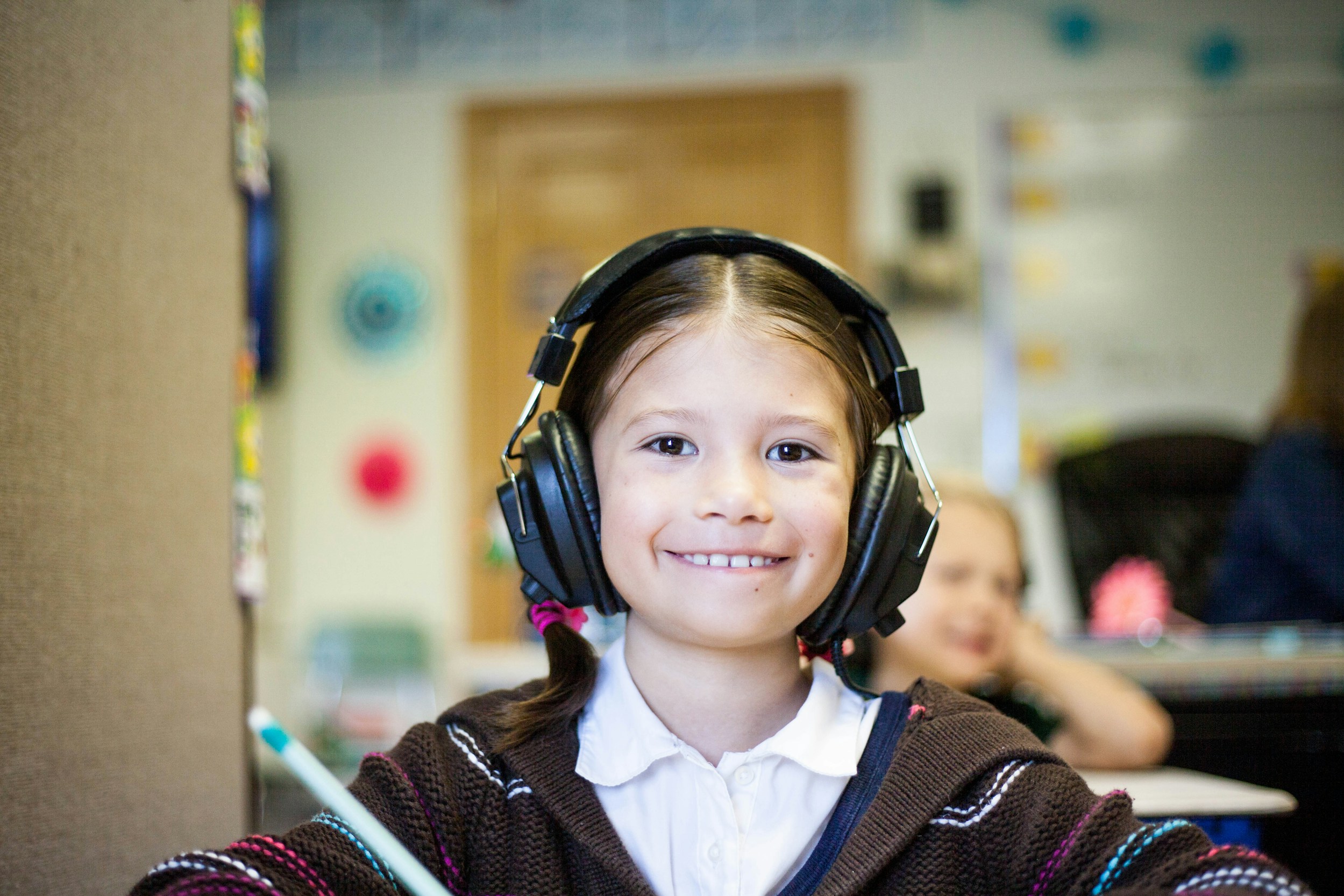
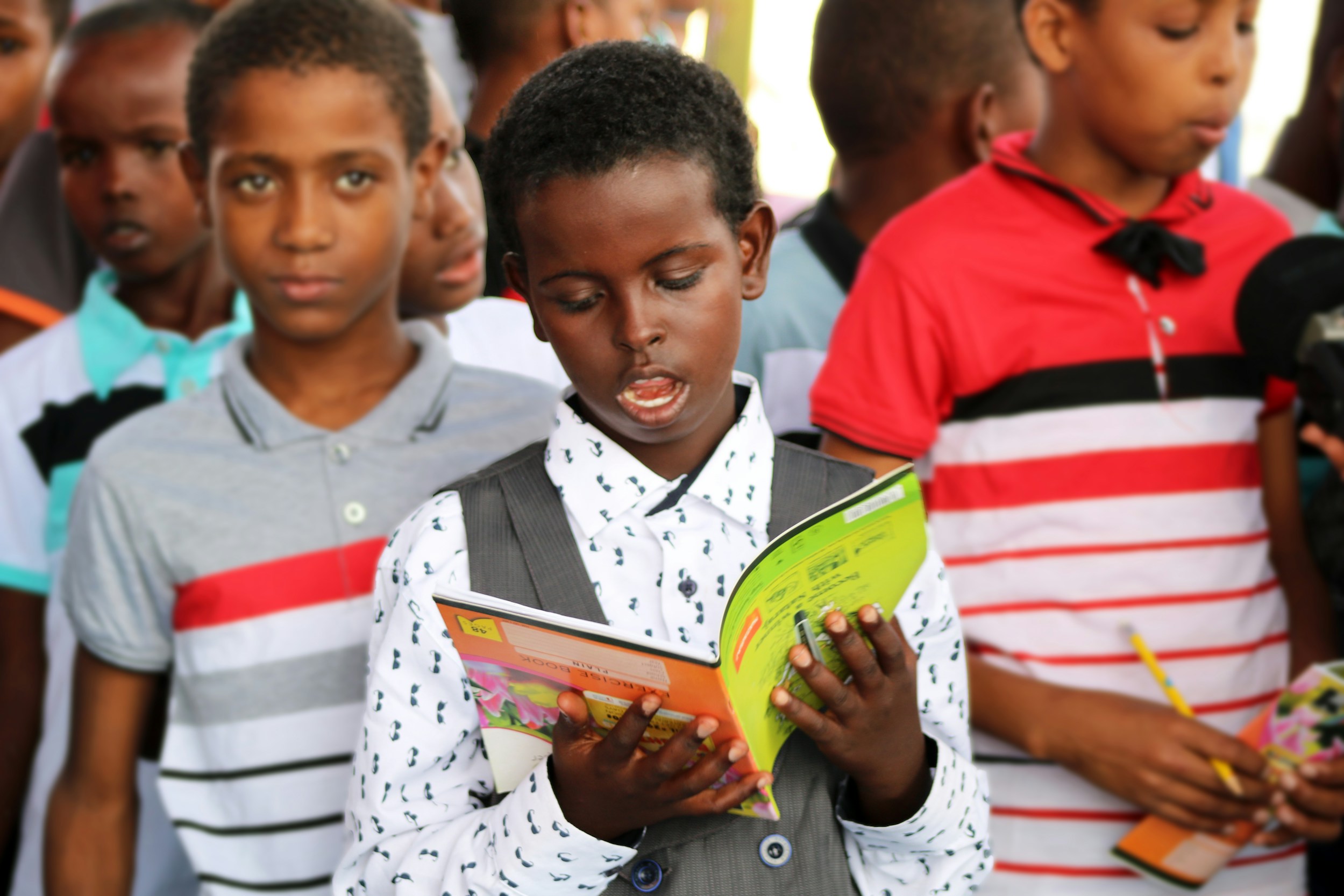
This application is tailored for dyslexic students, providing the support they need to match the learning pace of their peers and achieve success in the classroom.
What is the product?
The “Dyslexic Reading Game” is a school-friendly app where students play short, story-driven games to develop reading skills and keep pace with their classmates. Guided by “Musa,” a black-crowned crane mascot inspired by the client’s Nigerian roots, the app makes learning fun, engaging, and supportive.
Where does the product currently stand?
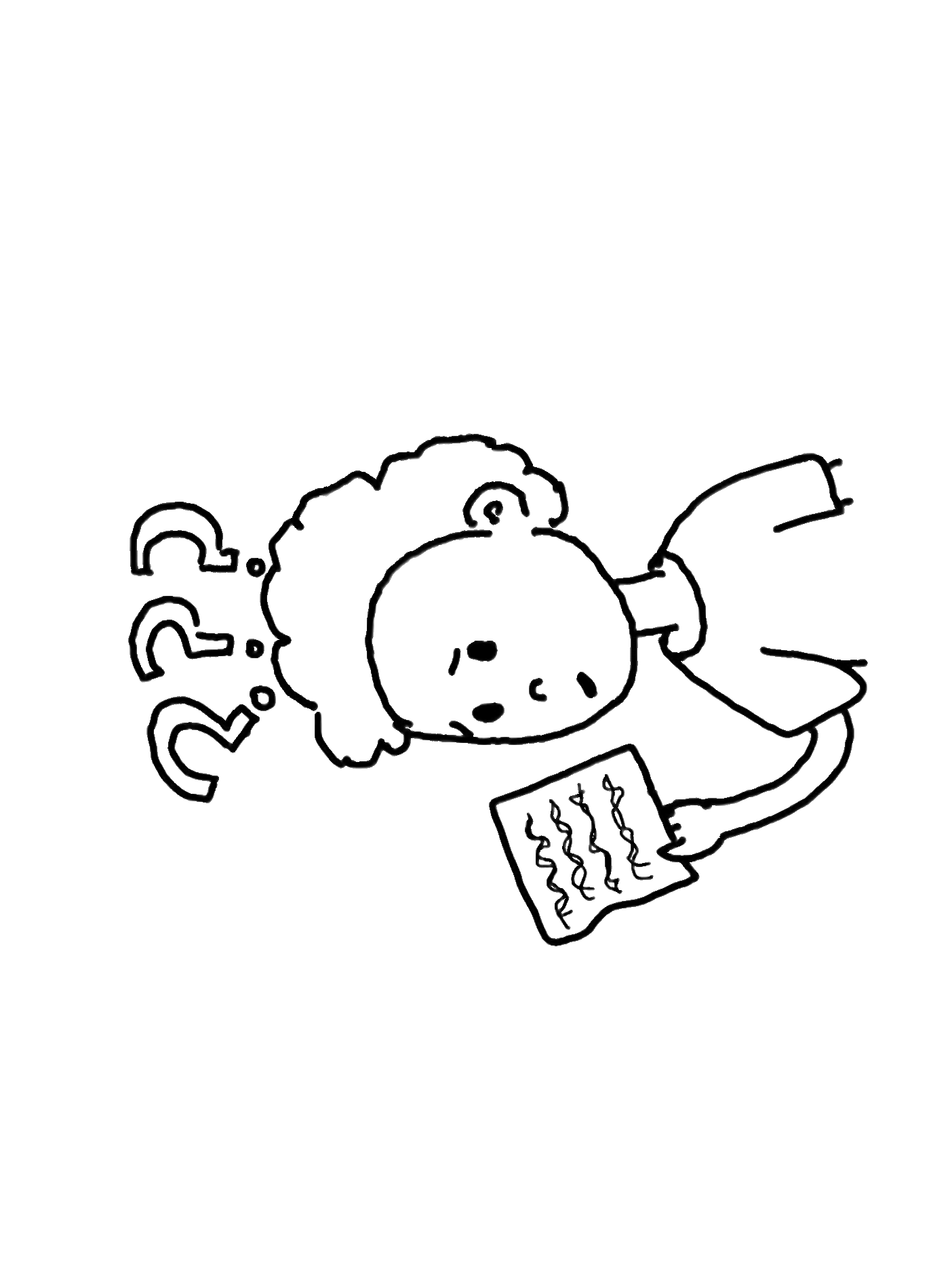
The product is in phase 3 of development. With the MVP currently being iterated and worked on, the design team is creating the core essentials for the site while the research team continues to flesh out how to best tackle dyslexic users’ needs.
Insufficient research on game screens makes design decisions more difficult and challenges the team to move the app forward while fulfilling client and shareholder needs.
The Problem
The Solution
Implement an AI support tool to aid users in navigating Epic's extensive patient data, enabling healthcare workers to optimize workflow and enhance patient care.

Streamlined Onboarding
- Randomized 4 digit numerical codes allow for easy creation of student accounts
- UI follows accessibility standards for both dyslexic and young users
- Congruent UI between educator and student screens present a polished product

Mascot Iteration & Avatar Customization
- Gives students immediate ownership and feeling of autonomy over account
- This, along with onboarding videos, alludes the student to the in game experiences
View Final Prototype
Onboarding
Process
Previous Phase Insights
Core application components had not yet been finalized nor brought to high fidelity. Below are key findings and solutions pertaining to previous phase work and usability testing.
Research
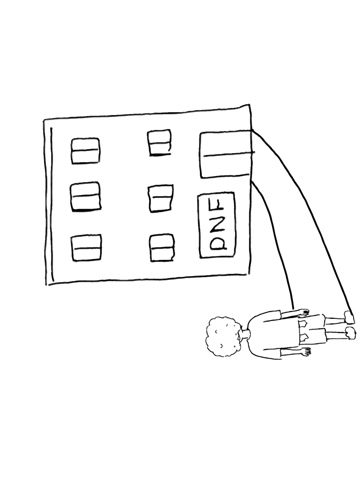
Product Origins
The product was originally requested by the Nigerian Dyslexia Foundation, a nonprofit dedicated to raising awareness, diagnosing, and supporting individuals with dyslexia in Nigeria, where resources and understanding around learning differences remain limited.
In partnership with Tech Fleet, a U.S.-based nonprofit that connects apprentices to real-world projects, a digital reading application is currently being created to provide dyslexic students, parents, and teachers with an accessible learning platform.
While the product originated with a focus on Nigerian learners, by the end of Phase 3 it pivoted toward serving a broader global audience, though its foundation is rooted in addressing the challenges faced in Nigeria.
Persona
The product is meant to supplement additional learning for young dyslexic users in a classroom environment, with children learning how to combat their dyslexia in a supervised, communal setting. These learning sessions provide real time feedback to teachers, as well as encourage the student to view dyslexia learning as fun and rewarding.
Below is a revised persona from the product’s previous phase.
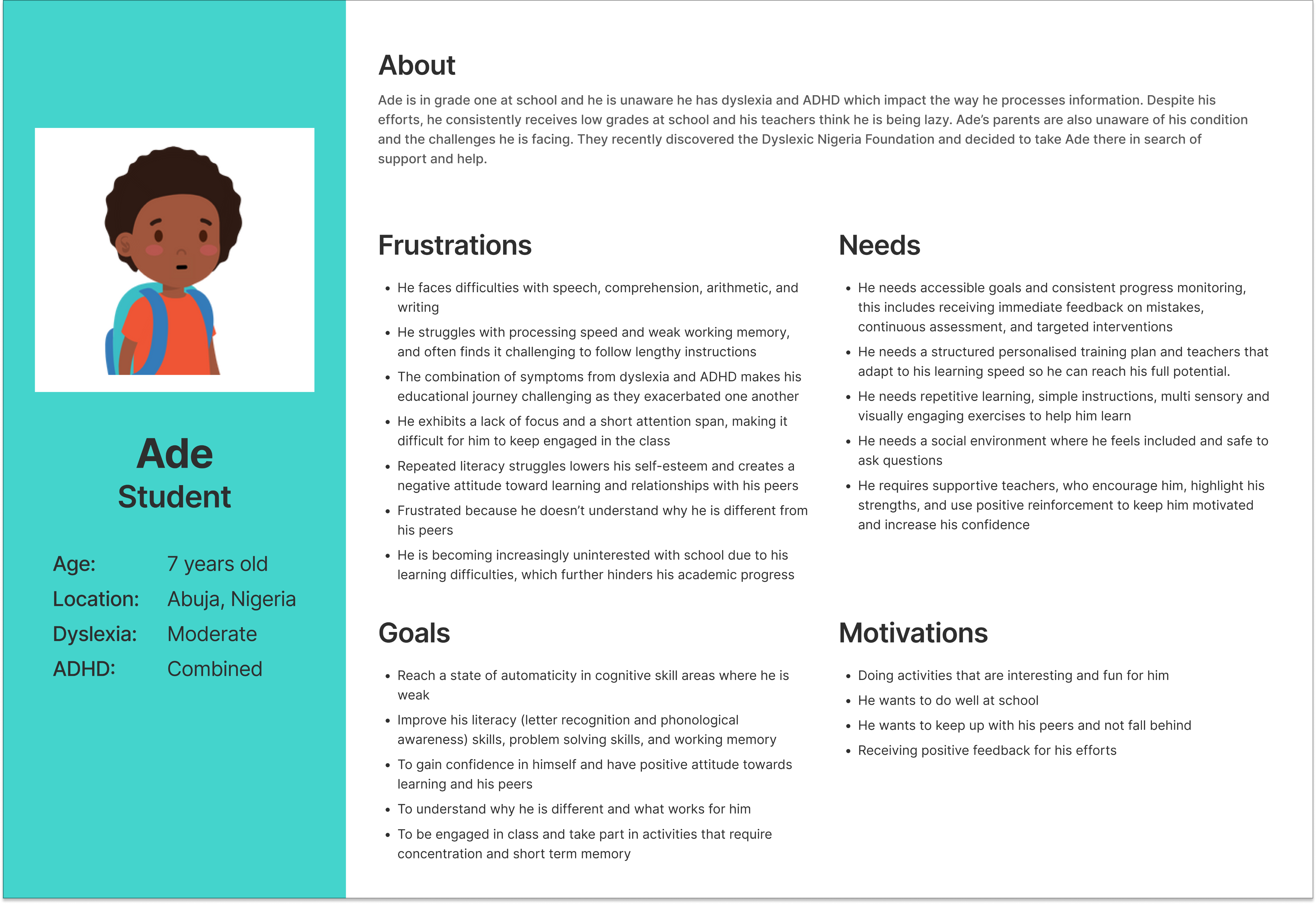
The child, Ade, is a typical representation of a dyslexic, Nigerian child; Not only does he face difficulties with reading, memory, and writing, he also faces social stigmas and shame related to these.
The game is meant to be fun and engaging, to help children who are feeling downtrodden in their current studies feel better prepared mentally and emotionally.
At the product’s current development, the designers of phase 3 needed to focus on core components of the application, such as smooth, intuitive onboarding flows, and high fidelity feature choices, that would showcase the product as enjoyable and trusting.
1. Incomplete User Flow
The student user journey lacks a clear and complete flow, especially for first-time users (e.g., Sign Up, Avatar Selection, Onboarding). These flows should be synced with corresponding educator flows.
Solution:
Finish onboarding flows appropriate for a school age dyslexic user. Sync student user flows with the educators’ when applicable.
2. Navigation Gaps & Lacking Usability
Several interface components are missing standard navigational elements (e.g., carousel controls, backward navigation).
- Lack of Breadcrumb Navigation - The wireframes lack contextual cues to help users understand where they are within the app or how to return to previous sections. This can lead to user confusion, especially in multi-step flows.
Some UI elements (e.g., call-to-action buttons, visual feedback mechanisms) are not intuitive or engaging enough, which could hinder user interaction.
Solution:
Add back buttons and carousel arrows to help users orient themselves and move through the app easily. Enhance call-to-action buttons with clear labels and visual feedback, such as hover states or confirmation messages, to make interactions more intuitive and engaging.
3. Wireframes Not Finalized
Prior iterations used for usability testing confused student users because of low fidelity. The current designs require iteration and refinement to resolve these gaps and align with best practices in accessibility and user-centered design.
Solution:
Apply consistent visual feedback and hierarchy to improve orientation and usability. Have frames finalized and brought to a higher fidelity in order to have items for usability testing.
4. Lack of cohesion between student and educator designs.
Current designs for student and educator frames do not match up. Although meant for different types of users, the designs must match for easy identification and branding.
Solution:
The separate teams for the student and educator designs must communicate, and ensure that the higher fidelity frames have congruence.
Revised Onboarding Flows
Syncing the student and educator, iterating the existing flows with specific features
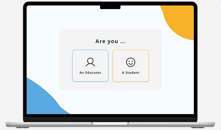
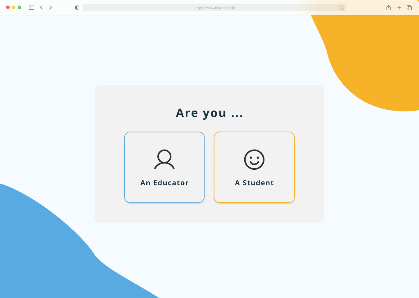
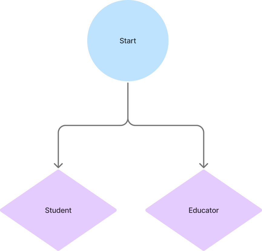
The onboarding flows were recreated, and formatted with the assumption of a single hero page deviating into two separate user flows (student or educator) when an option is chosen. The educator option is designed to allow for student login with supervision, to accommodate various situations.
Additional features were also added into the flow to make the registration and login process intuitive and straightforward.
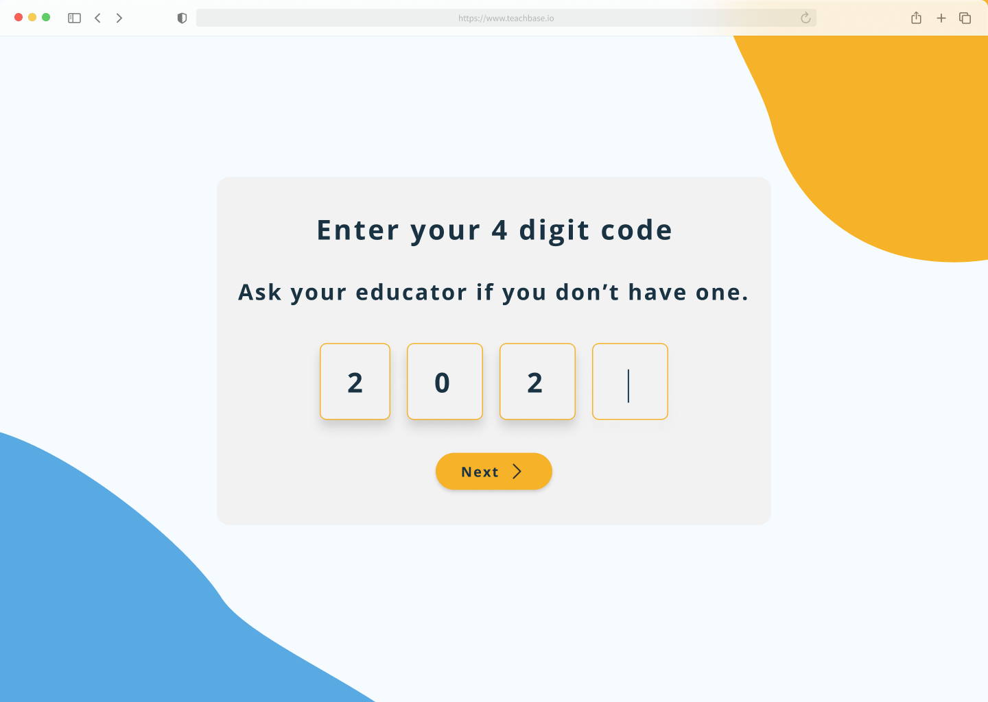
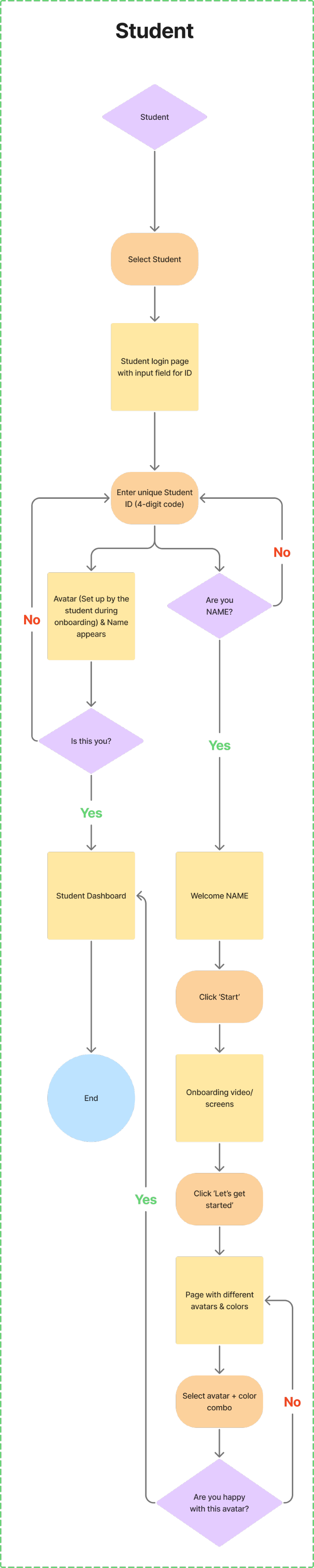
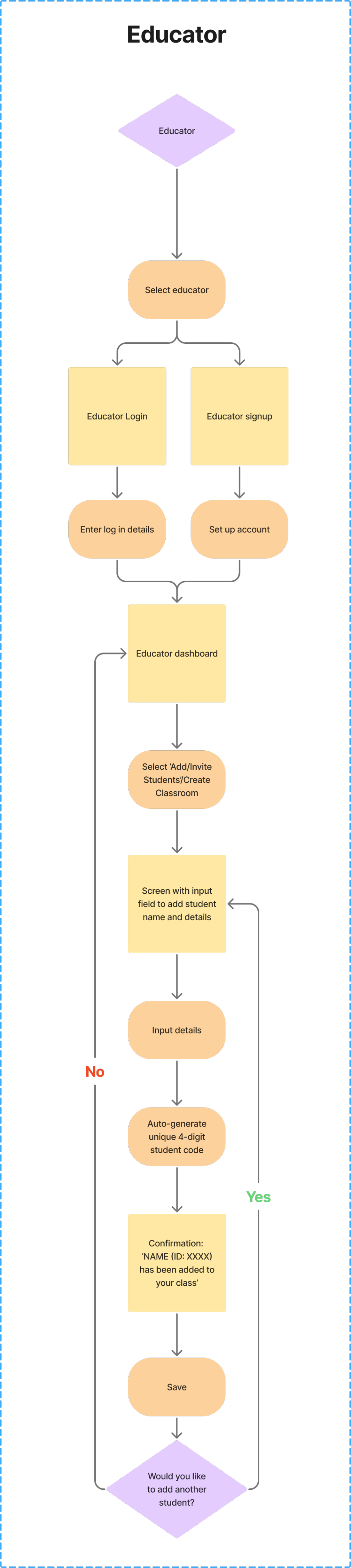
- Instead of student emails and passwords, which would likely be cumbersome for grade school students to keep track of, they’re given 4 digit numerical codes for account access.
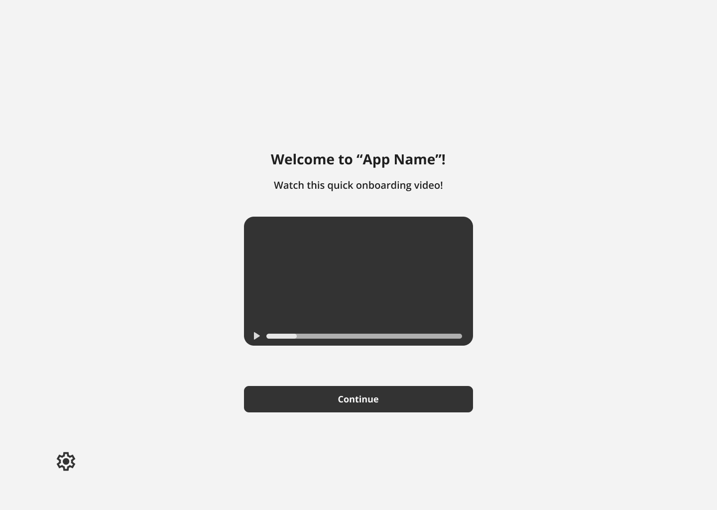
- Included in this process is an onboarding video and/or visual animation that demonstrates what the user will be doing inside the application.
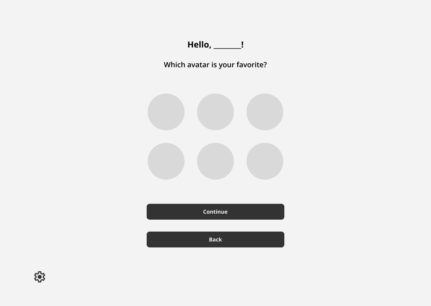
- Customization, such as avatar selection, will also be provided for the student to feel ownership during account creation.
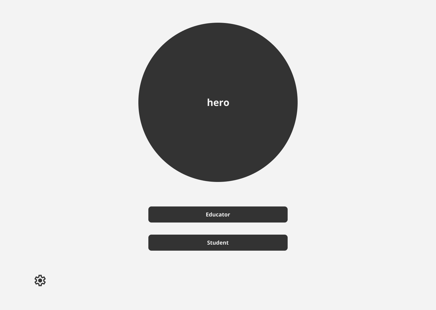
Onboarding Flows
Low Fidelity Onboarding Frames
Student Registration Frames
Student Login Frames
- Minimal amount of words used for instruction. Less words to read for dyslexic users.
Onboarding flow with minimal friction.
- Large colorful CTA buttons that help the user easily progress
- Centered image and text, with little background decoration
A minimal interface with little distraction - Ideal for both young and dyslexic users.
User Need
Applied Design
User Need
Applied Design
Style Guide
Creating the Interface
With the onboarding flows and low fidelity drafts finalized, the design team focused on researching accessibility for dyslexic users, gamification for learning games, and on styles for the user interface.
Accessibility
With the onboarding flows and low fidelity drafts finalized, the design team focused on researching accessibility for dyslexic users, gamification for learning games, and on styles for the user interface.
Accessibility needs extra consideration with this product, as the team needs to make sure that the chosen designs are appropriate for dyslexic users. Any hindrance to their reading ability during onboarding could both impede the process, and cause discouragement.
Below is listed research we compiled for this product’s design guidelines.
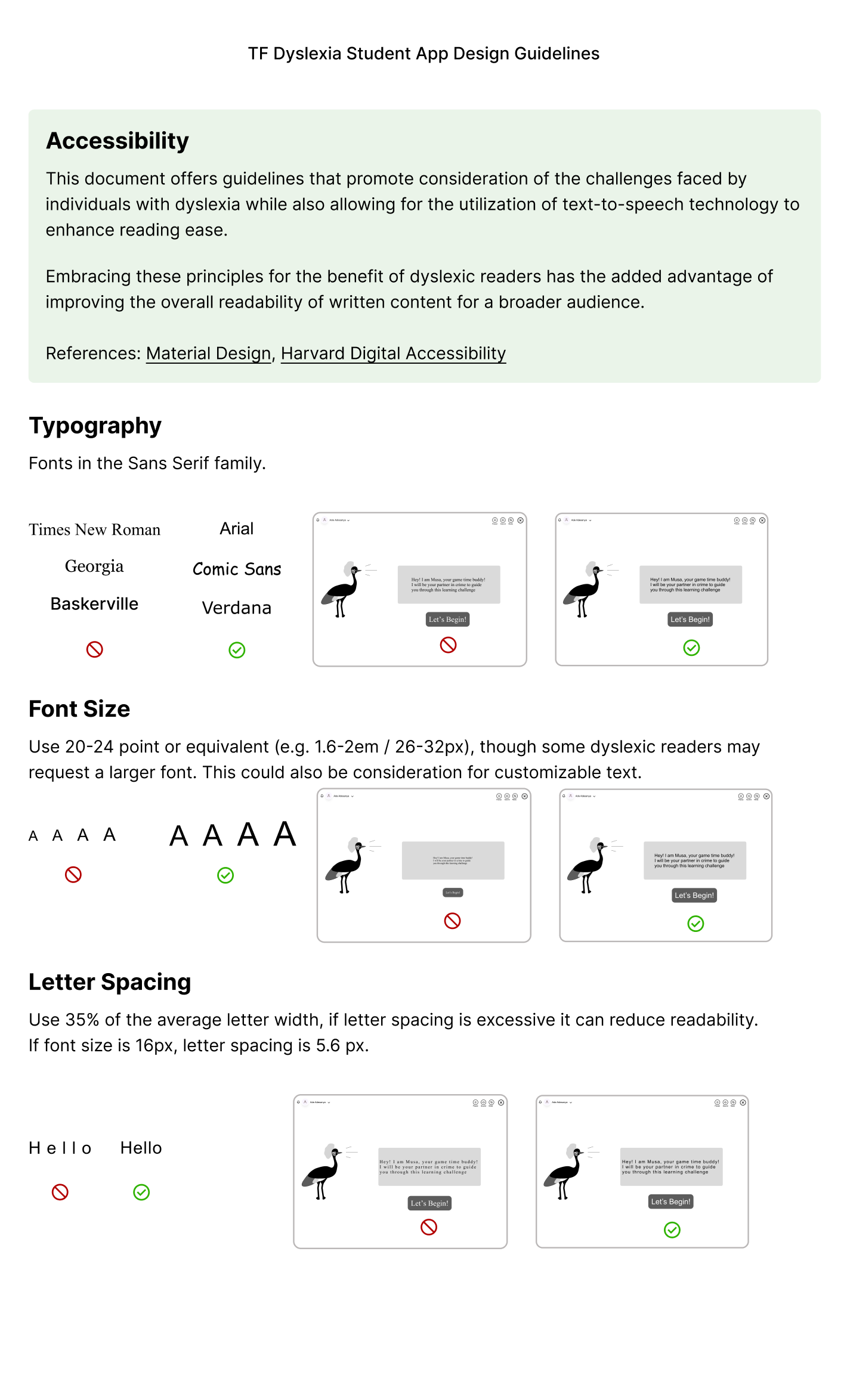
Typography
- Fonts: Sans Serif (Arial, Verdana, Comic Sans) reduce visual crowding of letters, and improve readability for dyslexic readers.
- Font Size: 20–24 pt, since larger sizes improve reading accuracy by helping readers focus on individual letters or words.
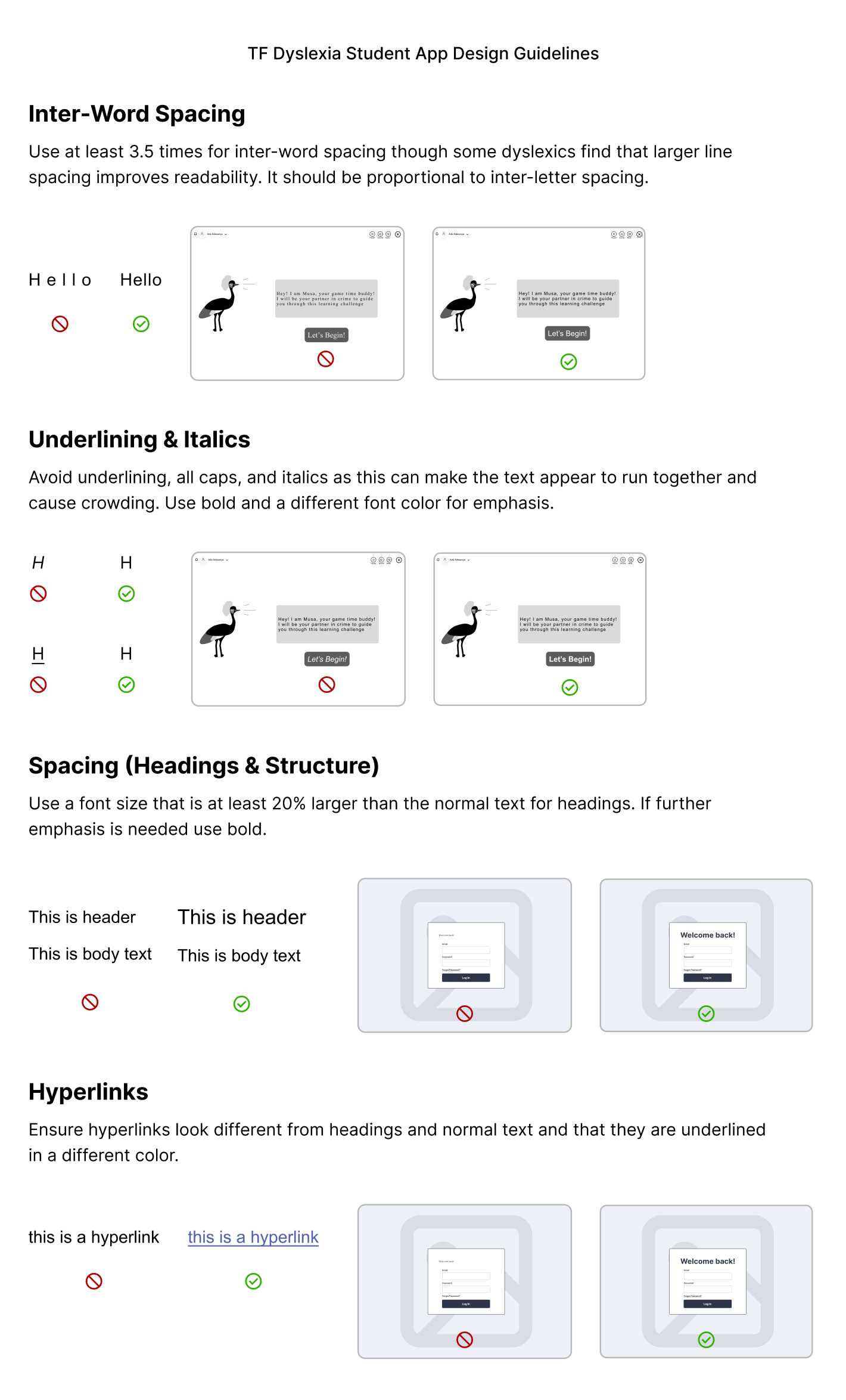
Spacing
- 35% Letter Spacing: Generous spacing reduce letter confusion and improve scanning speed for dyslexic readers. Studies (British Dyslexia Association, Rello & Baeza-Yates, 2013) show that modestly expanded spacing (35%) improves reading speed and comprehension.
- 3.5x Inter-word Spacing: Extra spacing between words helps readers identify word boundaries clearly and reduce the perception that words are running together. This combats user struggles with word segmentation.
- Underlining & Italics: Distorts letterforms, making text harder for dyslexic users to read. These should be avoided.
- Spacing (Headings): Visual Hierarchy helps readers to scan pages and distinguish between text, regardless of dyslexia or not.
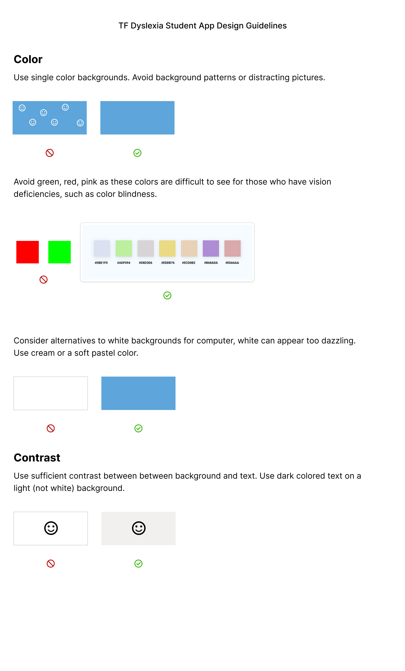
Color & Contrast
- Use of single color backgrounds reduces visual noises and keeps users focused on directional text.
- Avoid green, red, and pink (common color blindness issues).
- Use cream or soft pastels instead of pure white to reduce glare.
- Ensure sufficient contrast: dark text on light backgrounds.
- Rationale: Proper contrast and color selection increase legibility and reduce eye strain (WCAG 2.1 guidelines).
Emphasis & Links
- Avoid italics, underlining, and all caps; use bold or color for emphasis instead.
- Hyperlinks should be visually distinct and underlined in a separate color. For dyslexic readers, clear differentiation prevents confusion between body text, headings, and actionable links, reducing cognitive load and improving navigation.
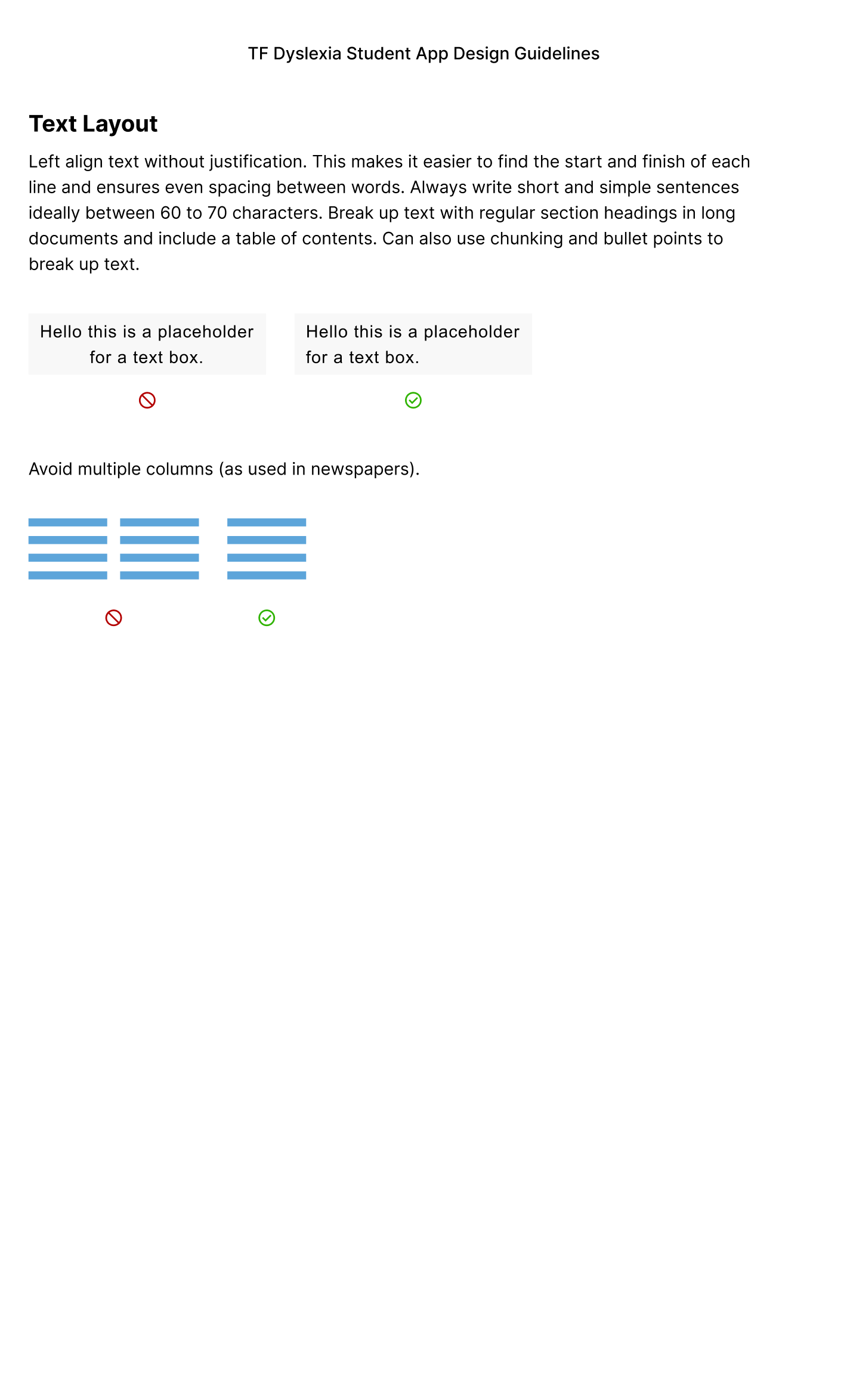
Text Layout & Structure
- Left-align text: Helps dyslexic readers track lines more easily.
- Short, simple sentences (60–70 characters) reduce cognitive load and support faster word recognition.
- Break content into headings, bullet points, and chunks; include a table of contents for long documents. This lets the user easily scan text.
- Headings at least 20% larger than body text; use bold for emphasis.
User Interface
Once initial guidelines were in place, the design team was free to begin choosing brand elements that would later be the make up of the high fidelity frames.
The main UI elements worked on this phase include:
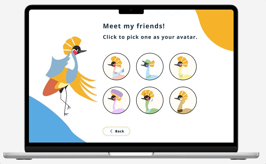
- Mascot Iteration & Avatars
- Colors
- Typography
- Grids
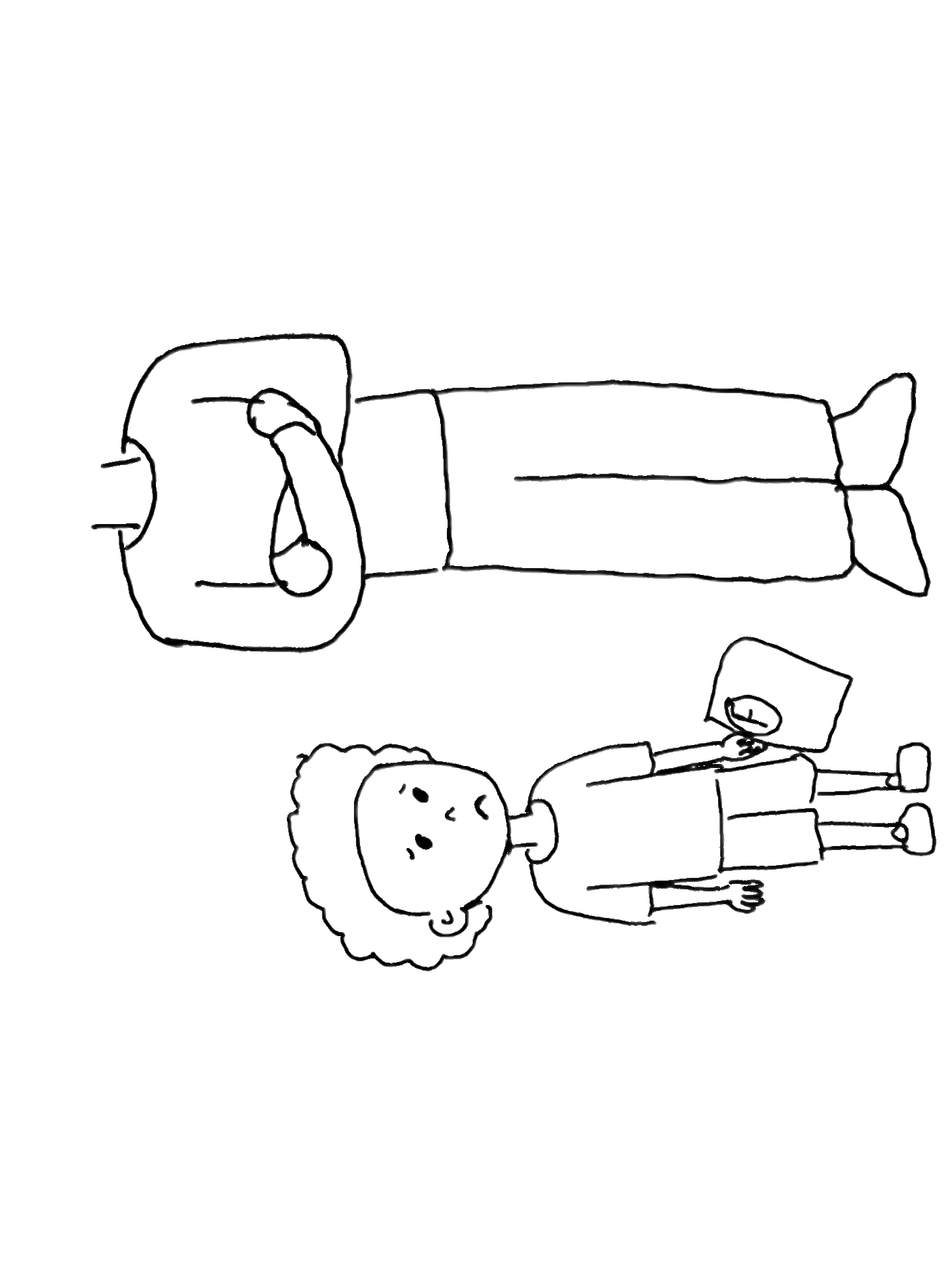
Musa!
The face of the mascot and the avatars, Musa takes inspiration from the national Nigerian bird, the Black Crowned Crane.
Iterations on Musa at this stage were important - He is the backbone of the of the product’s user interactions.
He has the role of:
- Guiding through Account Creation & Onboarding
- Main character through story mode in the learning games
- Origin of the user avatars


Musa’s previous iteration
- Nigerian origin as a nod to the original client and user base
- Earthy color selection that mimics the real bird
- Illustration is made in a cartoon style for its younger user base


Avatar anatomical changes
Musa’s makeover
- Nigerian origin as a nod to the original client and user base
- Earthy color selection that mimics the real bird
- Illustration is made in a cartoon style for its younger user base

Reference Illustration
Avatar Creation
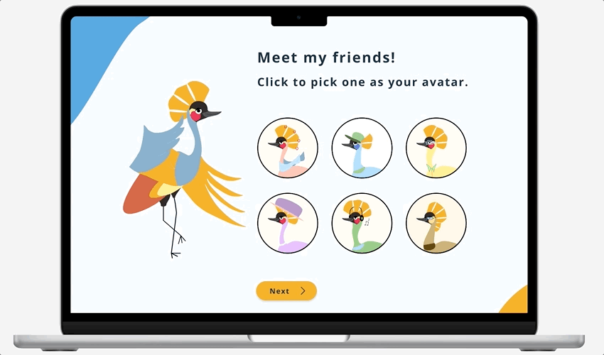
While working through the low fidelity onboarding frames, the design team decided on having recognizable avatars for the users to identify with. This would promote ownership of their accounts and serve as an easy way to identify themselves on any given screen.
We went through several avatar iterations, always keeping in mind that the avatars needed to be appropriate illustrations for young users, and that the design follows accessibility requirements.
Avatar Iteration v1
The design team originally wanted to make abstract facial avatars in different shapes. These were initially thought to be easy to design and implement, and appropriate for various age groups. These design colors are customizable.


Final Avatars
Musa was incorporated into avatar creation; These variations are his friends. Users would pick from these options, eliminating the need to customize color. These avatar characters also allow the user to be placed into the storylines of games.
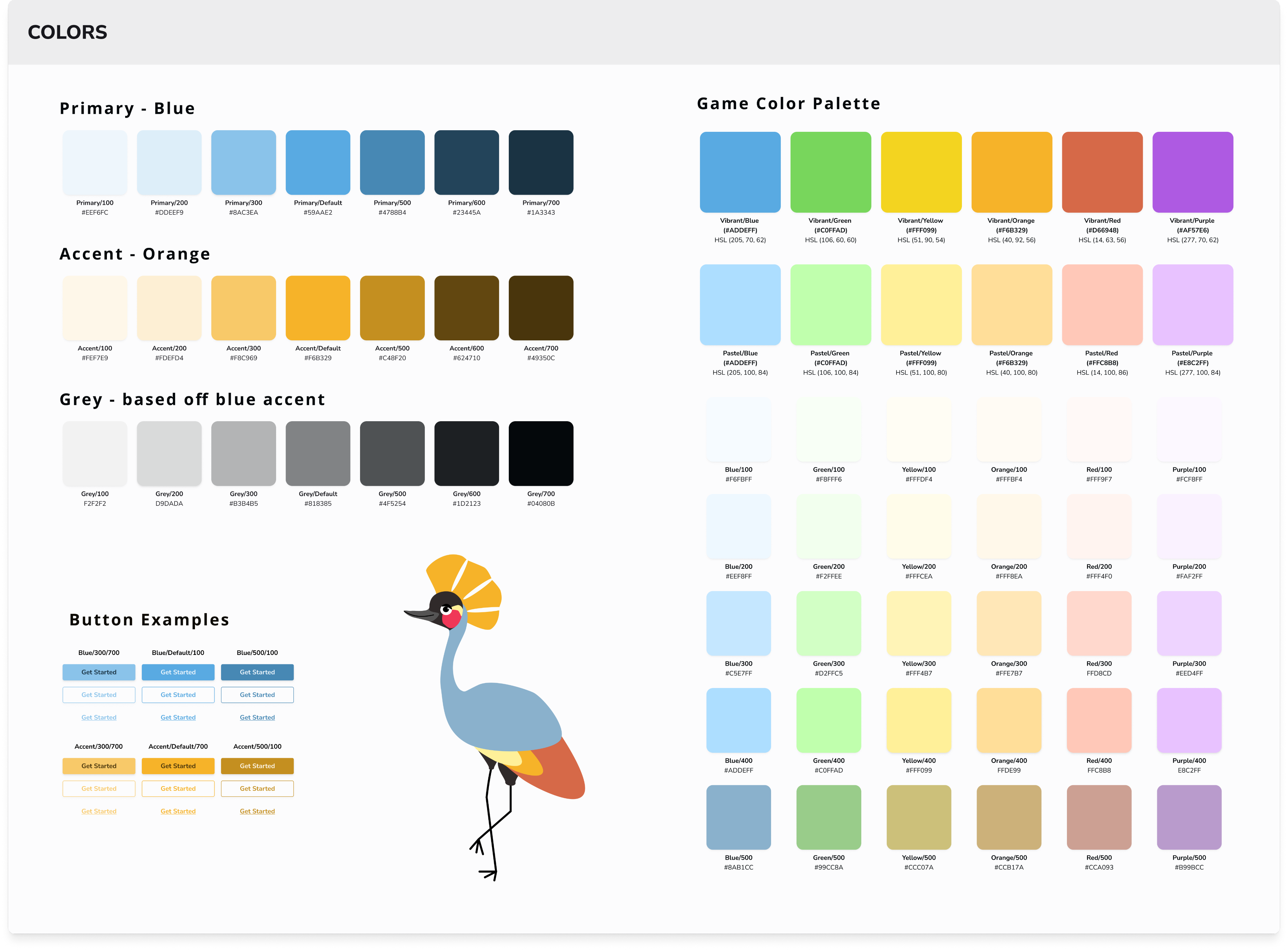
Color Palette
The primary, accent, and background colors all referenced Musa’s hues; The chosen colors should compliment Musa when he is on screen.
Numerous colors would be utilized for the game, so a large palette with specific saturations was selected. The team would need to be cognizant of green hues during user testing, and make sure that they are not causing any hindrance for dyslexic users.
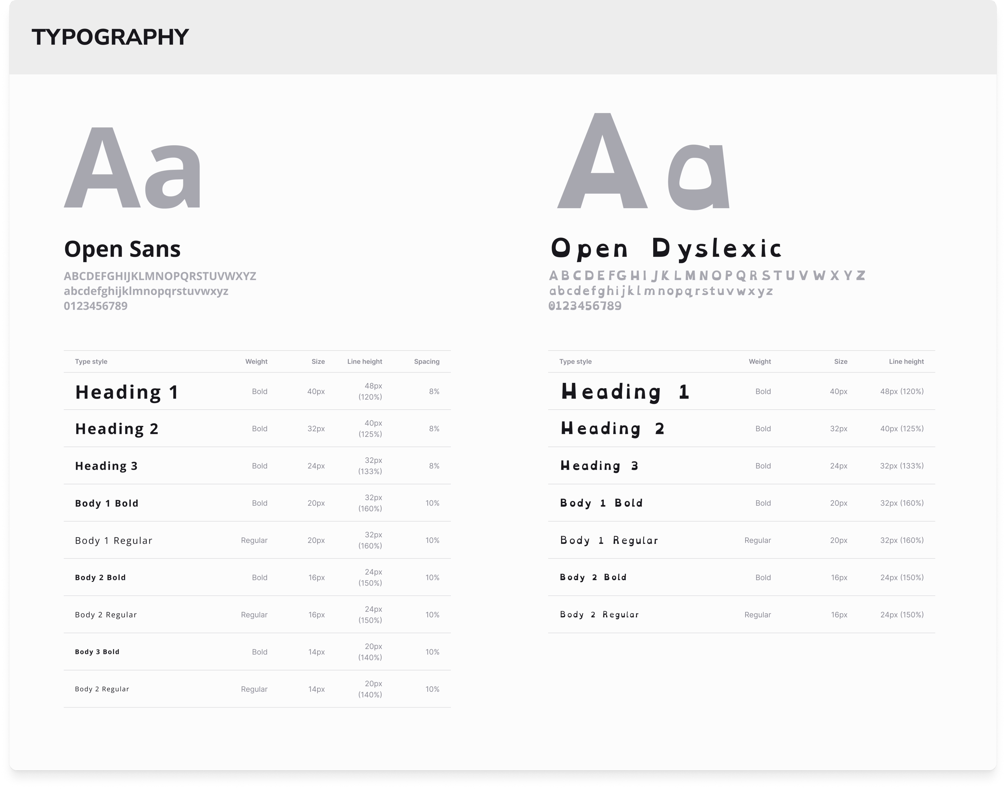
Typography
The design team chose ‘Open Sans’ and ‘Open Dyslexic’ for the product fonts. The educator side of the application will utilize ‘Open Sans’ only, whereas students will have the option to choose between ‘Open Sans’ and ‘Open Dyslexic’.
With ‘Open Dyslexic’, there is no need to increase letter spacing as the font already features this.
The absolute minimum text size for students should be 16px, so nothing smaller is included.
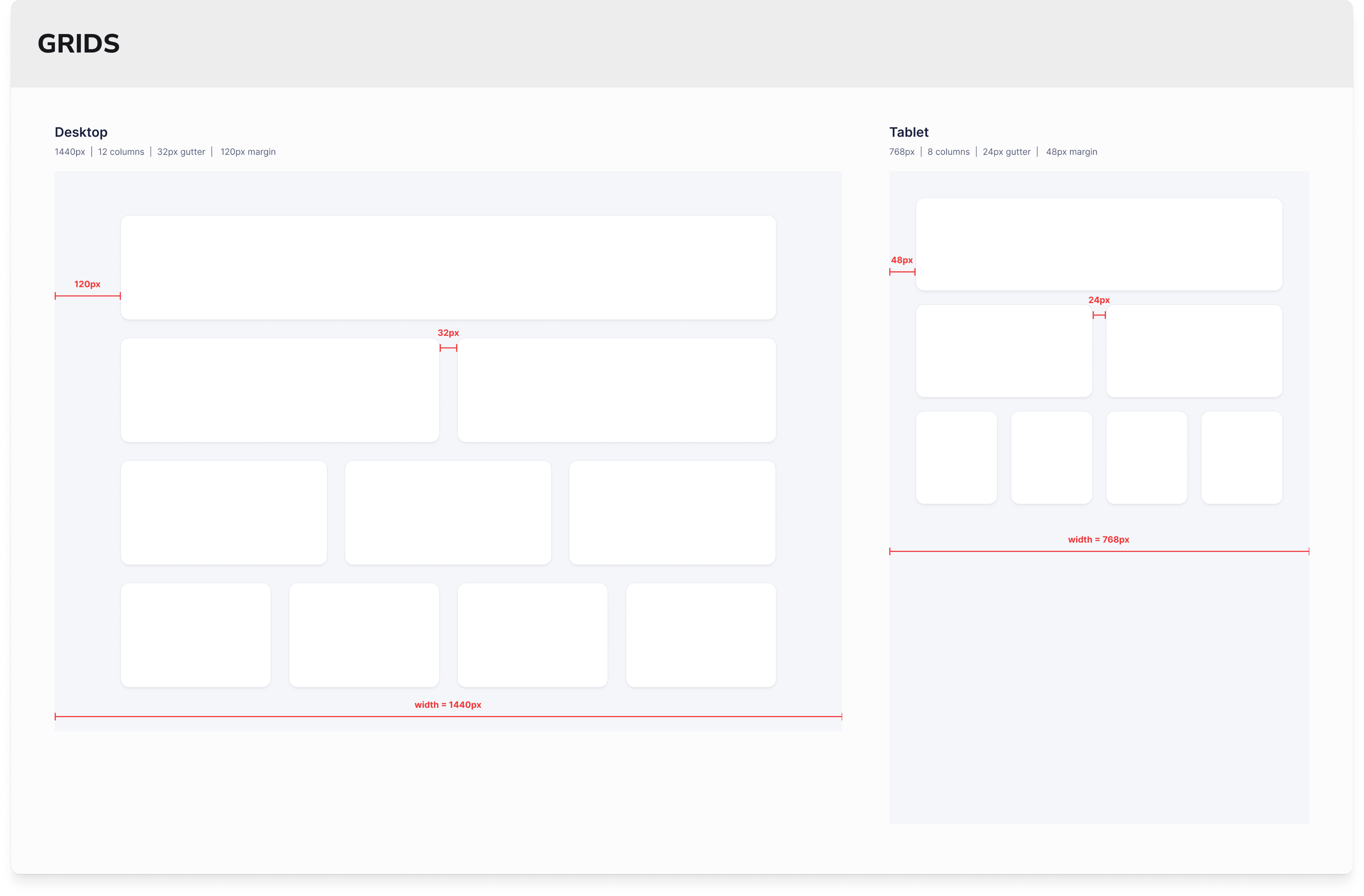
Grids
Standard grid sizes were decided on for desktop and tablet screens. Although the initial use for this product is desktop, the team is preparing tablet sizes for later features.
High Fidelity
Frames
Setting the Tone
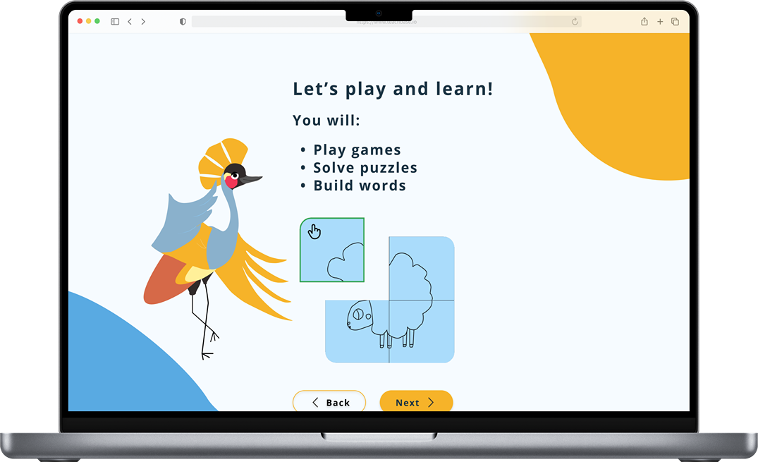
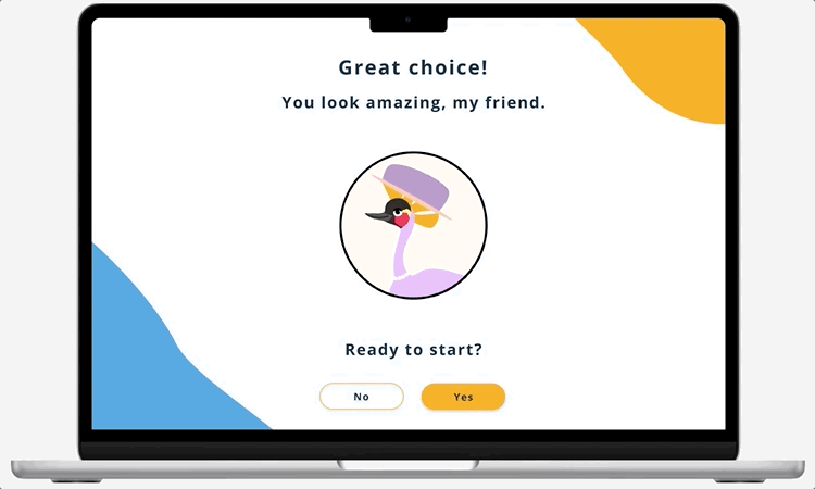
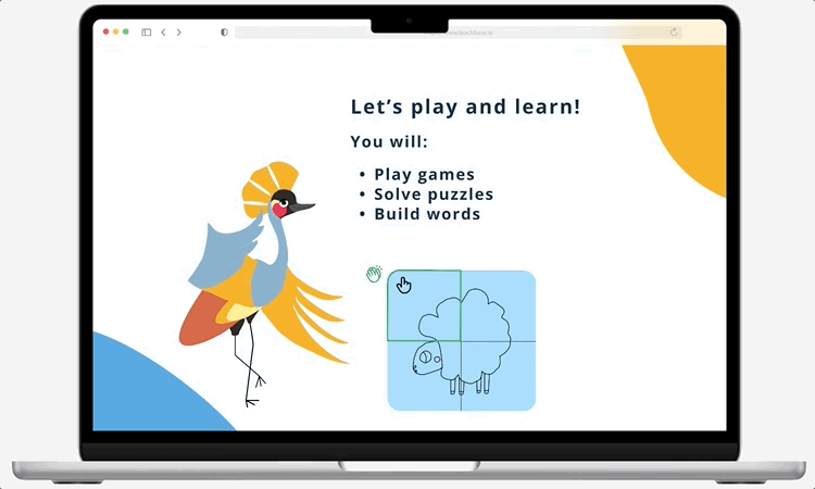
Combining the revised flows, low fidelity frames, accessibility guidelines, and new style guide, the design team crafted an onboarding flow that would introduce users and shareholders to the brand and the core feel of the user interface.
The screens were created with several things in mind:
- Short sentences to make onboarding easy for dyslexic users
- Large amount of peripheral white space to drive the user’s eyes to the center screen
- Animations to keep the user interested and excited for the product
- Blue and gold accents both add color to the screen and guide the user’s eyes to the grey and white space in the middle of the screen.
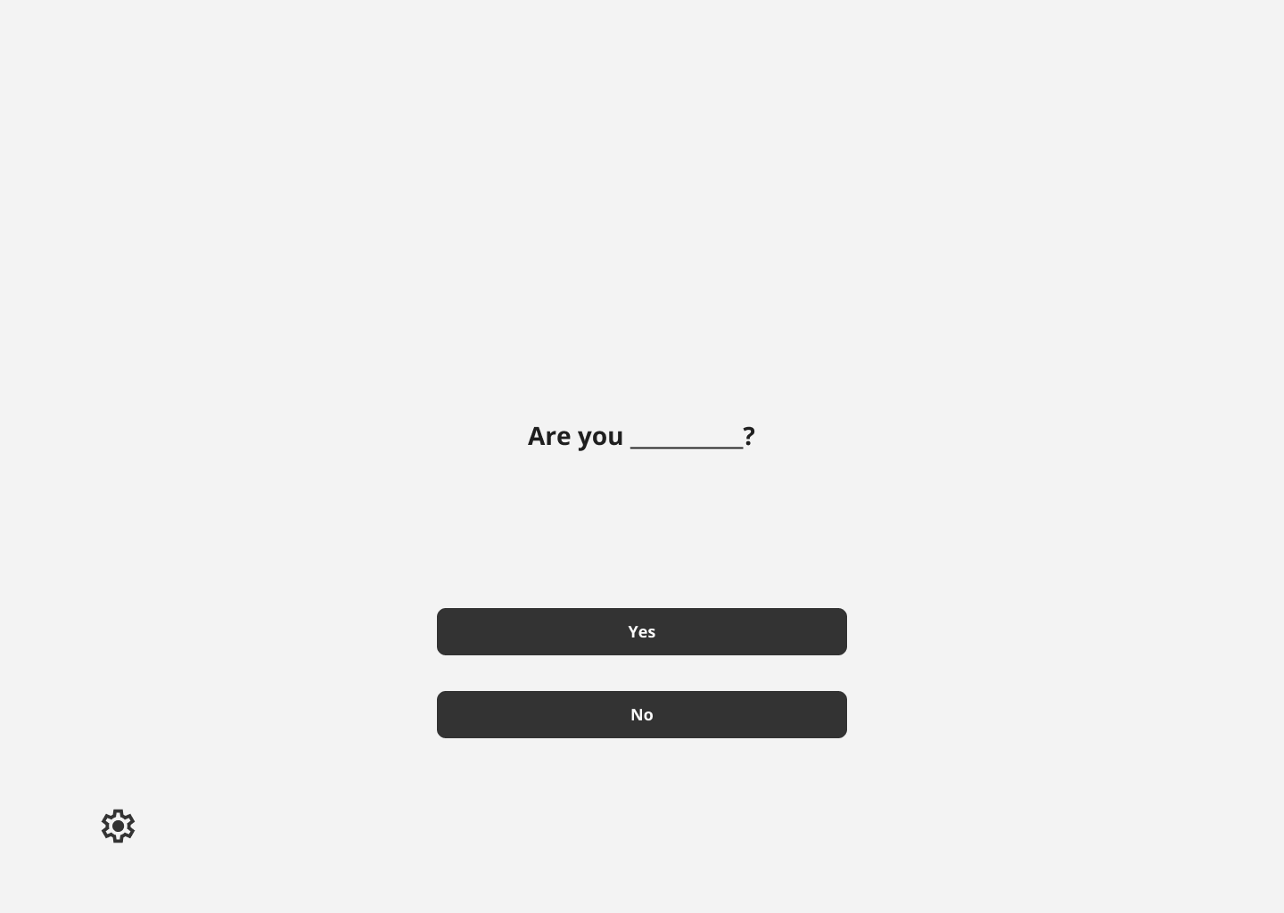
- Two outlined options indicate a CTA. The text is minimal and straightforward, with emoticons denoting whether a user is present for work/supervision (educator) or to play games (student).
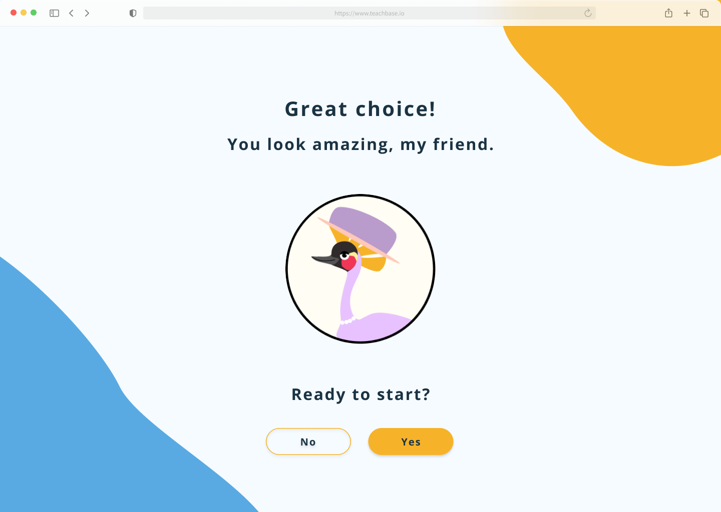
- Text is kept to a minimum, but has purposeful direction for young users onboarding.
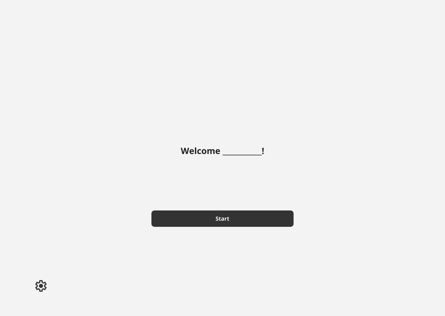
- A four digit code is given to students in place of them logging in with their username and password - An easier adjustment for young users.
- Users select from various customized avatars, and have the option to change them.
Animations
Animations were added to several frames for the onboarding flow, including avatars and game demonstrations. These immerse the user, and serve as a great visual guide for game demonstrations.
Results & Looking Forward
Insufficient research on game screens makes design decisions more difficult and challenges the team to move the app forward while fulfilling client and shareholder needs.
The Problem
The Solution
Implement an AI support tool to aid users in navigating Epic's extensive patient data, enabling healthcare workers to optimize workflow and enhance patient care.
Streamlined Onboarding
- Randomized 4 digit numerical codes allow for easy creation of student accounts
- UI follows accessibility standards for both dyslexic and young users
- Congruent UI between educator and student screens present a polished product
Mascot Iteration & Avatar Customization
- Gives students immediate ownership and feeling of autonomy over account
- This, along with onboarding videos, alludes the student to the in game experiences
View Final Prototype
Key Takeaways for Phase 4
Phase Four Tasks:
- User test the onboarding flow with high fidelity frames. Check efficacy of four digit codes and screens among students.
- Brainstorm features to be added to the dashboard UI.
- Phase 3 design team began writing game scenarios for students. These should be further iterated and tested based on gaming research.
- Continue to create cornerstone elements of the product to move along to an MMP. The research to make effective dyslexic games is the most challenging part of this product, and the design team should continue to find ways to progress prior to the research finishing.
Timeline
Tools
Responsibilities
UI/UX Designer
May 2025 - July 2025 (10 Weeks)
Figma, Google Workspace
Data Analysis, Information Architecture, Wireframing, Visual Design, Prototyping
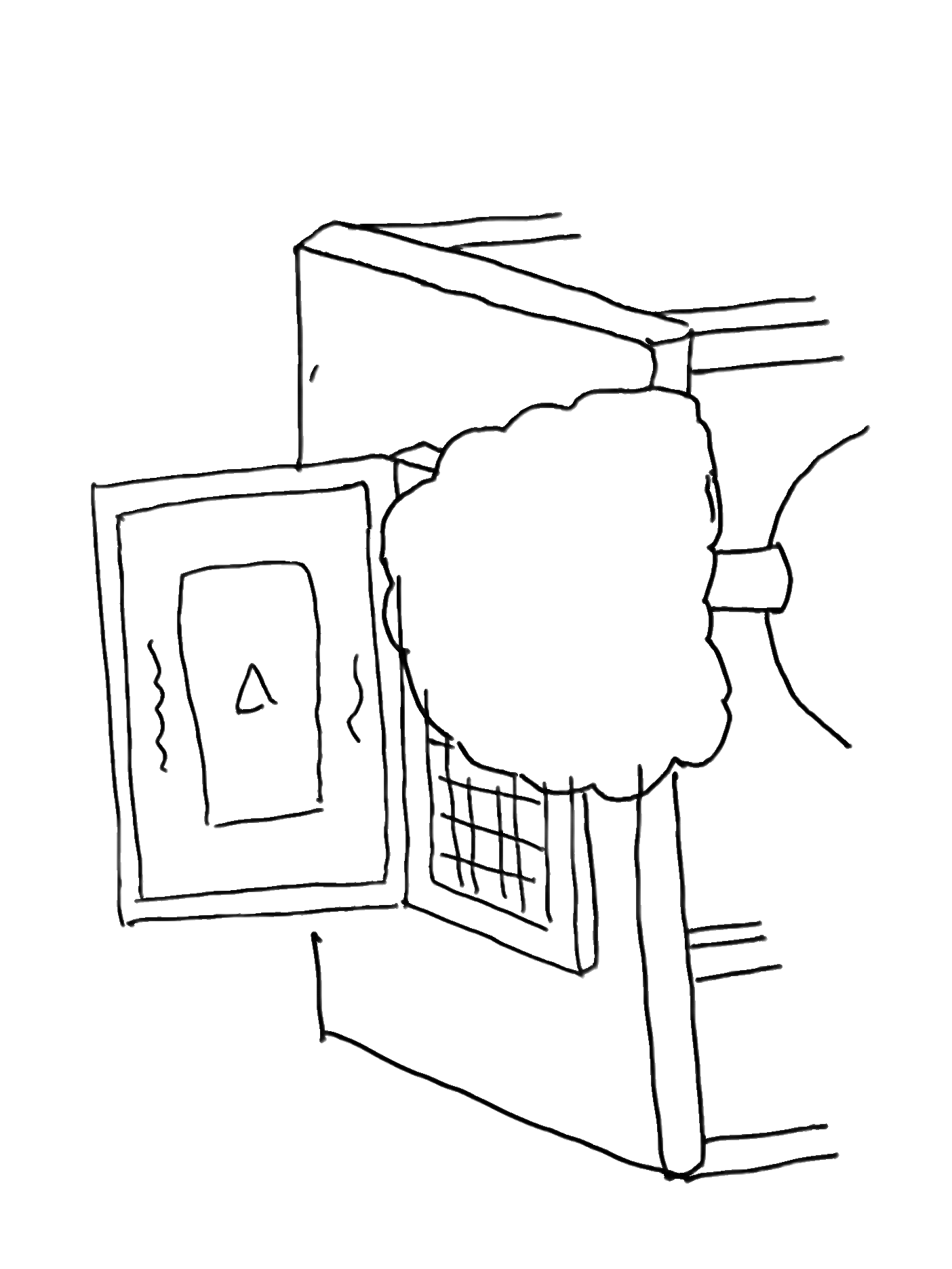
- Added an eyelid to make the eyelid to make the expression more friendly. The white light in the eye adds depth to Musa’s expression. His mouth has been shifted to add a slight smile.
- Added gaps to the crown to mimic the animal’s crest of stiff, golden feathers.
- Body color used from a reference illustration of the bird, similar to our pastel blue hues in the new color palette.
- Body proportions adjusted to ensure the new balance of the bird is realistic. The new adjustment makes the bird more unique and cartoon-like.
- Orange hue used from the reference illustration - It compliments the blue and it’s still an earthly tone.
- New balance position mimics movement.


I considered several criteria when creating the initial onboarding frames; Below are the needs I addressed when consolidating all the collected information into physical designs.
Role
Angelo Arambulo ⏤ 2025
Dyslexia Reading Game
This application is tailored for dyslexic students, providing the support they need to match the learning pace of their peers and achieve success in the classroom.
Role
UI/UX Designer
Timeline
May 2025 - July 2025(10 Weeks)
Tools
Figma, Google Workspace
Responsibilities
Data Analysis, Branding, Information Architecture, Wireframing, Visual Design, Prototyping
What is the product?
The “Dyslexic Reading Game” is a school-friendly app where students play short, story-driven games to develop reading skills and keep pace with their classmates. Guided by “Musa,” a black-crowned crane mascot inspired by the client’s Nigerian roots, the app makes learning fun, engaging, and supportive.
The product is in phase 3 of development. With the MVP currently being iterated and worked on, the design team is creating the core essentials for the site while the research team continues to flesh out how to best tackle dyslexic users’ needs.
Where does the product currently stand?
Insufficient research on game screens makes current design decisions more difficult and challenges the team to move the app forward while fulfilling client and shareholder expectations.
The Problem
The Solution
During this product phase, focus on the essentials: universal flows, high fidelity screens, dyslexic accessibility guidelines, and components that future teams can utilize.

Streamlined Onboarding
- Randomized 4 digit numerical codes allow for easy creation of student accounts
- UI follows accessibility standards for both dyslexic and young users
- Congruent UI between educator and student screens present a polished product

Mascot Iteration & Avatar Customization
- Gives students immediate ownership and feeling of autonomy over account
- This, along with onboarding videos, alludes the student to the in game experiences


View Final Prototype
Onboarding Process
Core application components had not yet been finalized nor brought to high fidelity. Below are key findings and solutions pertaining to previous phase work and usability testing.
Style Guide
With the onboarding flows and low fidelity drafts finalized, the design team focused on researching accessibility for dyslexic users, gamification for learning games, and on styles for the user interface.
With the onboarding flows and low fidelity drafts finalized, the design team focused on researching accessibility for dyslexic users, gamification for learning games, and on styles for the user interface.
Accessibility needs extra consideration with this product, as the team needs to make sure that the chosen designs are appropriate for dyslexic users. Any hindrance to their reading ability during onboarding could both impede the process, and cause discouragement.
Below is listed research we compiled for this product’s design guidelines.
Once initial guidelines were in place, the design team was free to begin choosing brand elements that would later be the make up of the high fidelity frames.
The main UI elements worked on this phase include:
- Mascot Iteration & Avatars
- Colors
- Typography
- Grids
Musa!
The face of the mascot and the avatars, Musa takes inspiration from the national Nigerian bird, the Black Crowned Crane.
Iterations on Musa at this stage were important - He is the backbone of the of the product’s user interactions.
He has the role of:
- Guiding through Account Creation & Onboarding
- Main character through story mode in the learning games
- Origin of the user avatars
High Fidelity Frames
Combining the revised flows, low fidelity frames, accessibility guidelines, and new style guide, the design team crafted an onboarding flow that would introduce users and shareholders to the brand and the core feel of the user interface.
The screens were created with several things in mind:
- Short sentences to make onboarding easy for dyslexic users
- Large amount of peripheral white space to drive the user’s eyes to the center screen
- Animations to keep the user interested and excited for the product
Results & Looking Forward
1. Incomplete User Flow
The student user journey lacks a clear and complete flow, especially for first-time users (e.g., Sign Up, Avatar Selection, Onboarding). These flows should be synced with corresponding educator flows.
Solution:
Finish onboarding flows appropriate for a school age dyslexic user. Sync student user flows with the educators’ when applicable.
2. Navigation Gaps & Lacking Usability
Several interface components are missing standard navigational elements (e.g., carousel controls, backward navigation).
There is a lack of breadcrumb navigation. The wireframes lack contextual cues to help users understand where they are within the app or how to return to previous sections. This can lead to user confusion, especially in multi-step flows.
Some UI elements (e.g., call-to-action buttons, visual feedback mechanisms) are not intuitive or engaging enough, which could hinder user interaction.
Solution:
Add back buttons and carousel arrows to help users orient themselves and move through the app easily. Enhance call-to-action buttons with clear labels and visual feedback, such as hover states or confirmation messages, to make interactions more intuitive and engaging.
Revised Onboarding Flows
Syncing the student and educator, iterating the existing flows with specific features
The onboarding flows were recreated, and formatted with the assumption of a single hero page deviating into two separate user flows (student or educator) when an option is chosen. The educator option is designed to allow for student login with supervision, to accommodate various situations.
Additional features were also added into the flow to make the registration and login process intuitive and straightforward.
- Instead of student emails and passwords, which would likely be cumbersome for grade school students to keep track of, they’re given 4 digit numerical codes for account access.
- Included in this process is an onboarding video and/or visual animation that demonstrates what the user will be doing inside the application.
- Customization, such as avatar selection, will also be provided for the student to feel ownership during account creation.
- The onboarding flow starts on a hero image, and deviates into two user options.
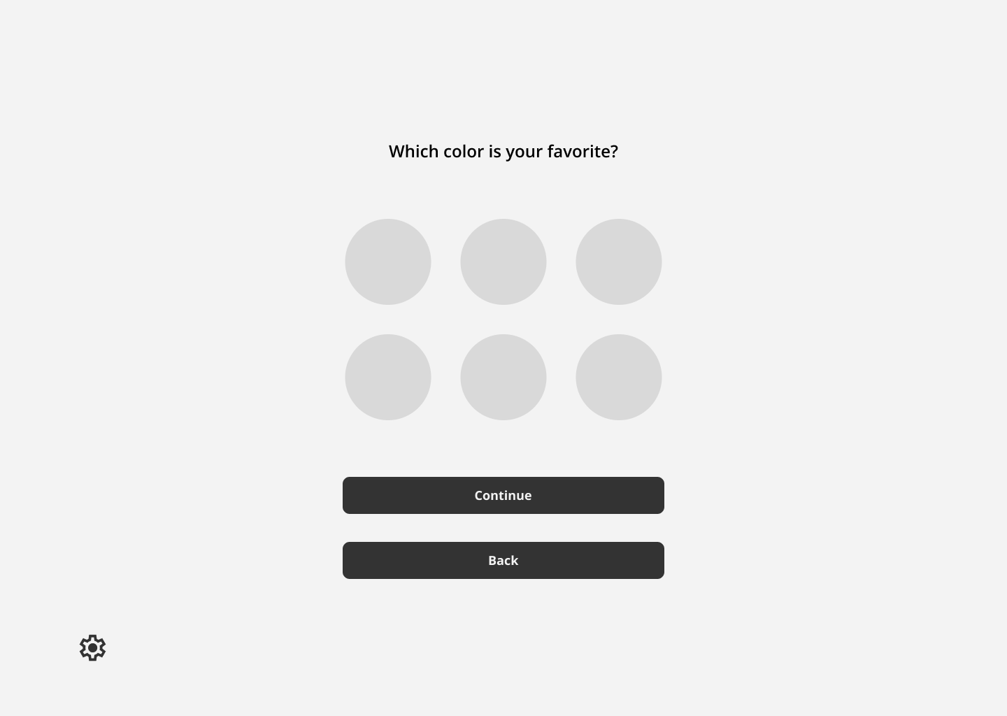
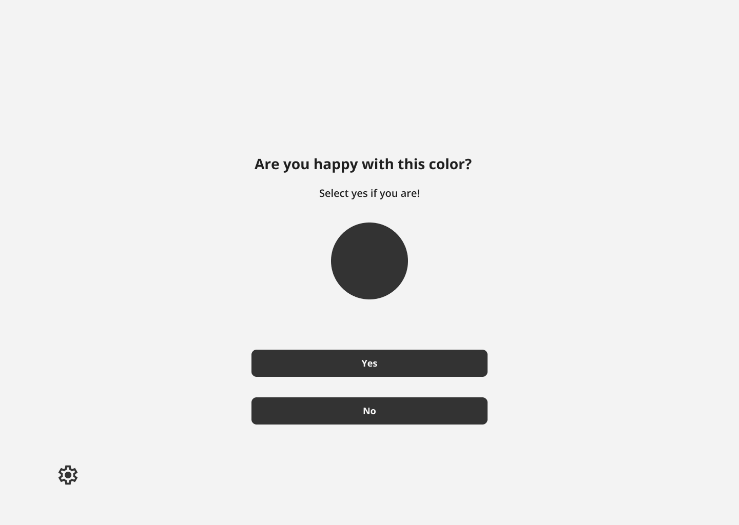
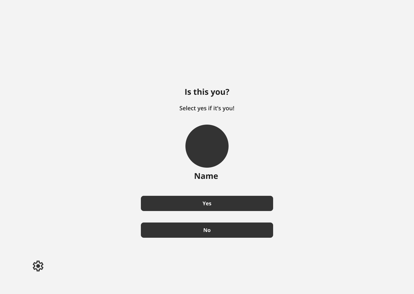
Low Fidelity Onboarding Frames
I considered several criteria when creating the initial onboarding frames; Below are the needs I addressed when consolidating all the collected information into physical designs.
User Needs
Applied Design
A minimal interface with little distraction - Ideal for both young and dyslexic users.
- Large colorful CTA buttons that help the user easily progress
- Centered image and text, with little background decoration
- Minimal amount of words used for instruction. Less words to read for dyslexic users.
Onboarding flow with minimal friction.
Student Registration Frames
Student Login Frames
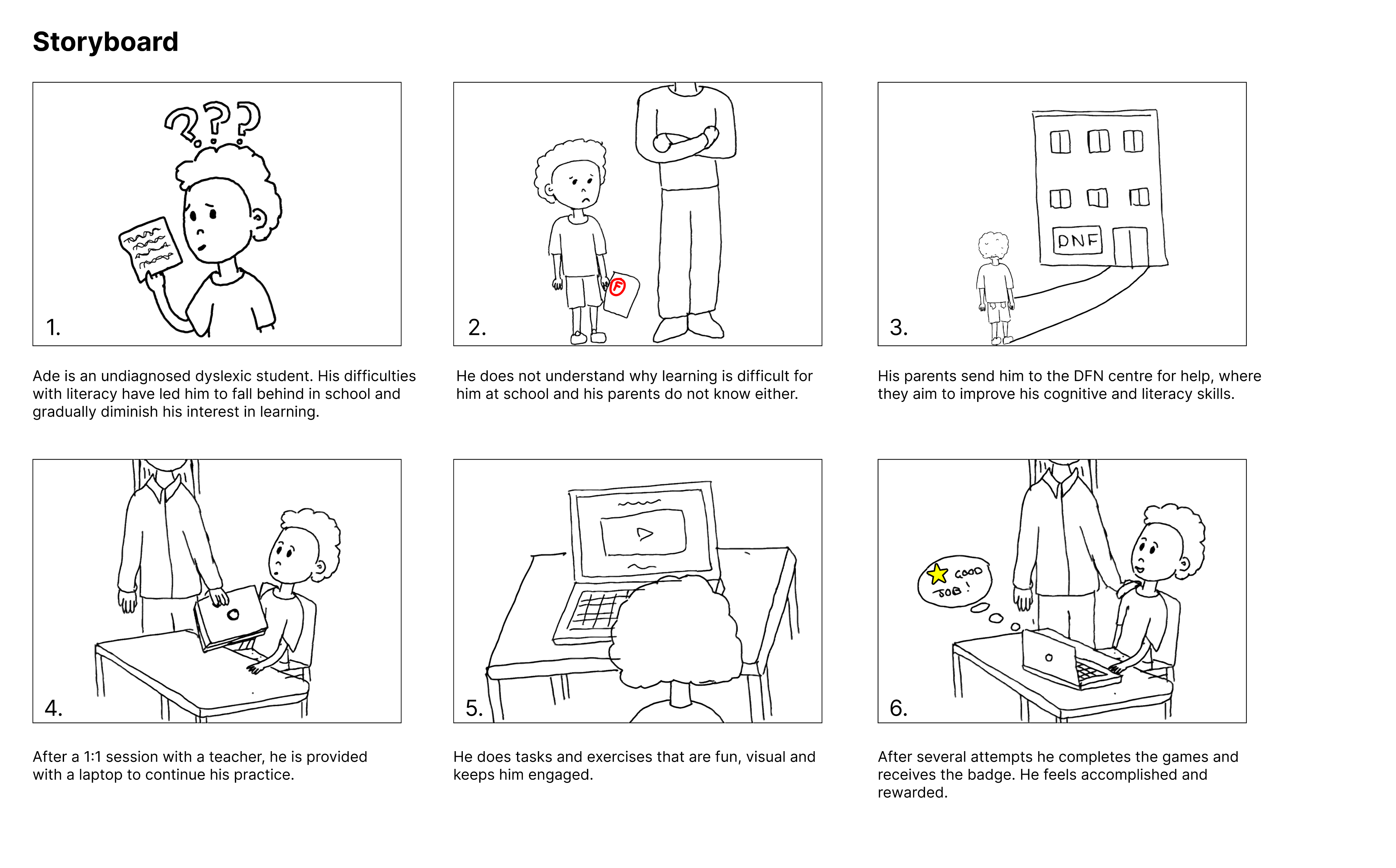
Ade is an undiagnosed dyslexic student. His difficulties
with literacy have led him to fall behind in school and
gradually diminish his interest in learning.
3.
2.
1.
4.
5.
6.
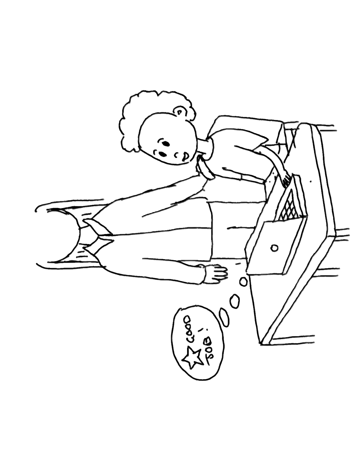
Storyboard
He does not understand why learning is difficult for
him at school and his parents do not know either.
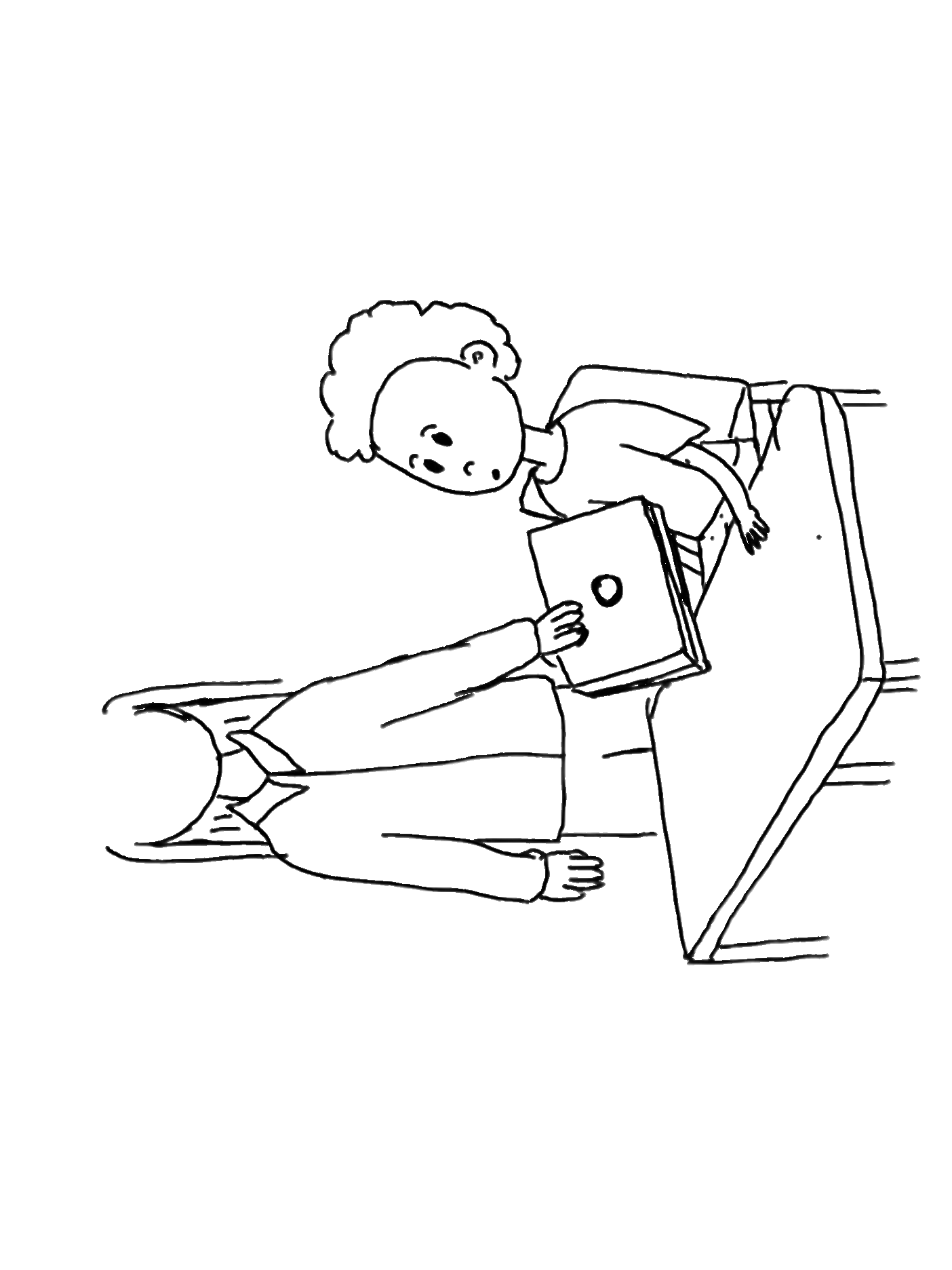
His parents send him to the DFN centre for help, where
they aim to improve his cognitive and literacy skills.
After a 1:1 session with a teacher, he is provided with a laptop to continue his practice.
He does tasks and exercises that are fun, visual and keeps him engaged.
After several attempts he completes the games and receives the badge. He feels accomplished and rewarded.


Research
The product was originally requested by the Nigerian Dyslexia Foundation, a nonprofit dedicated to raising awareness, diagnosing, and supporting individuals with dyslexia in Nigeria, where resources and understanding around learning differences remain limited.
In partnership with Tech Fleet, a U.S.-based nonprofit that connects apprentices to real-world projects, a digital reading application is currently being created to provide dyslexic students, parents, and teachers with an accessible learning platform.
While the product originated with a focus on Nigerian learners, by the end of Phase 3 it pivoted toward serving a broader global audience, though its foundation is rooted in addressing the challenges faced in Nigeria.
The product is meant to supplement additional learning for young dyslexic users in a classroom environment, with children learning how to combat their dyslexia in a supervised, communal setting. These learning sessions provide real time feedback to teachers, as well as encourage the student to view dyslexia learning as fun and rewarding.
Below is a revised persona from the product’s previous phase.
The child, Ade, is a typical representation of a dyslexic, Nigerian child; Not only does he face difficulties with reading, memory, and writing, he also faces social stigmas and shame related to these.
The game is meant to be fun and engaging, to help children who are feeling downtrodden in their current studies feel better prepared mentally and emotionally.
At the product’s current development, the designers of phase 3 needed to focus on core components of the application, such as smooth, intuitive onboarding flows, and high fidelity feature choices, that would showcase the product as enjoyable and trusting.
Typography
- Fonts: Sans Serif (Arial, Verdana, Comic Sans) reduce visual crowding of letters, and improve readability for dyslexic readers.
- Font Size: 20–24 pt, since larger sizes improve reading accuracy by helping readers focus on individual letters or words.
Color & Contrast
- Use of single color backgrounds reduces visual noises and keeps users focused on directional text.
- Avoid green, red, and pink (common color blindness issues).
- Use cream or soft pastels instead of pure white to reduce glare.
- Ensure sufficient contrast: dark text on light backgrounds.
- Rationale: Proper contrast and color selection increase legibility and reduce eye strain (WCAG 2.1 guidelines).
Text Layout & Structure
- Left-align text: Helps dyslexic readers track lines more easily.
- Short, simple sentences (60–70 characters) reduce cognitive load and support faster word recognition.
- Break content into headings, bullet points, and chunks; include a table of contents for long documents. This lets the user easily scan text.
- Headings at least 20% larger than body text; use bold for emphasis.
Emphasis & Links
- Avoid italics, underlining, and all caps; use bold or color for emphasis instead.
- Hyperlinks should be visually distinct and underlined in a separate color. For dyslexic readers, clear differentiation prevents confusion between body text, headings, and actionable links, reducing cognitive load and improving navigation.
Spacing
- 35% Letter Spacing: Generous spacing reduce letter confusion and improve scanning speed for dyslexic readers. Studies (British Dyslexia Association, Rello & Baeza-Yates, 2013) show that modestly expanded spacing (35%) improves reading speed and comprehension.
- 3.5x Inter-word Spacing: Extra spacing between words helps readers identify word boundaries clearly and reduce the perception that words are running together. This combats user struggles with word segmentation.
- Underlining & Italics: Distorts letterforms, making text harder for dyslexic users to read. These should be avoided.
- Spacing (Headings): Visual Hierarchy helps readers to scan pages and distinguish between text, regardless of dyslexia or not.

- Nigerian origin as a nod to the original client and user base
- Earthy color selection that mimics the real bird
- Illustration is made in a cartoon style for its younger user base
- Nigerian origin as a nod to the original client and user base
- Earthy color selection that mimics the real bird
- Illustration is made in a cartoon style for its younger user base
While working through the low fidelity onboarding frames, the design team decided on having recognizable avatars for the users to identify with. This would promote ownership of their accounts and serve as an easy way to identify themselves on any given screen.
We went through several avatar iterations, always keeping in mind that the avatars needed to be appropriate illustrations for young users, and that the design follows accessibility requirements.
The design team originally wanted to make abstract facial avatars in different shapes. These were initially thought to be easy to design and implement, and appropriate for various age groups. These design colors are customizable.


Added gaps to the crown to mimic the animal’s crest of stiff, golden feathers.
Body color used from a reference illustration of the bird, similar to our pastel blue hues in the new color palette.
Body proportions adjusted to ensure the new balance of the bird is realistic. The new adjustment makes the bird more unique and cartoon-like.
Orange hue used from the reference illustration - It compliments the blue and it’s still an earthy tone.
New balance position mimicking movement.
Added an eyelid to make the expression more friendly. The white light in the eye adds depth to Musa’s expression. His mouth has been shifted to add a slight smile.
Reference Illustration


Musa was incorporated into avatar creation; These variations are his friends. Users would pick from these options, eliminating the need to customize color. These avatar characters also allow the user to be placed into the storylines of games.
The primary, accent, and background colors all referenced Musa’s hues; The chosen colors should compliment Musa when he is on screen.
Numerous colors would be utilized for the game, so a large palette with specific saturations was selected. The team would need to be cognizant of green hues during user testing, and make sure that they are not causing any hindrance for dyslexic users.
The design team chose ‘Open Sans’ and ‘Open Dyslexic’ for the product fonts. The educator side of the application will utilize ‘Open Sans’ only, whereas students will have the option to choose between ‘Open Sans’ and ‘Open Dyslexic’.
With ‘Open Dyslexic’, there is no need to increase letter spacing as the font already features this.
The absolute minimum text size for students should be 16px, so nothing smaller is included.
Standard grid sizes were decided on for desktop and tablet screens. Although the initial use for this product is desktop, the team is preparing tablet sizes for later features.
Text is kept to a minimum, but has purposeful direction for young users onboarding.

A four digit code is given to students in place of them logging in with their username and password - An easier adjustment for young users.

Blue and gold accents both add color to the screen and guide the user’s eyes to the grey and white space in the middle of the screen.

Two outlined options indicate a CTA. The text is minimal and straightforward, with emoticons denoting whether a user is present for work/supervision (educator) or to play games (student).


Users select from various customized avatars, and have the option to change them.
Animations were added to several frames for the onboarding flow, including avatars and game demonstrations. These immerse the user, and serve as a great visual guide for game demonstrations.
Insufficient research on game screens makes current design decisions more difficult and challenges the team to move the app forward while fulfilling client and shareholder expectations.
The Problem
The Solution
During this product phase, focus on the essentials: universal flows, high fidelity screens, dyslexic accessibility guidelines, and components that future teams can utilize.
Streamlined Onboarding
- Randomized 4 digit numerical codes allow for easy creation of student accounts
- UI follows accessibility standards for both dyslexic and young users
- Congruent UI between educator and student screens present a polished product
Mascot Iteration & Avatar Customization
- Gives students immediate ownership and feeling of autonomy over account
- This, along with onboarding videos, alludes the student to the in game experiences
Key Takeaways for Phase 4
Phase Four Tasks:
- User test the onboarding flow with high fidelity frames. Check efficacy of four digit codes and screens among students.
- Brainstorm features to be added to the dashboard UI.
- Phase 3 design team began writing game scenarios for students. These should be further iterated and tested based on gaming research.
- Continue to create cornerstone elements of the product to move along to an MMP. The research to make effective dyslexic games is the most challenging part of this product, and the design team should continue to find ways to progress prior to the research finishing.
View Final Prototype
- Wireframes Not Finalized
Prior iterations used for usability testing confused student users because of low fidelity. The current designs require iteration and refinement to resolve these gaps and align with best practices in accessibility and user-centered design.
Solution:
Apply consistent visual feedback and hierarchy to improve orientation and usability. Have frames finalized and brought to a higher fidelity in order to have items for usability testing.
- Lack of cohesion between student and educator designs.
Current designs for student and educator frames do not match up. Although meant for different types of users, the designs must match for easy identification and branding.
Solution:
The separate teams for the student and educator designs must communicate, and ensure that the higher fidelity frames have congruence.
Product Origins
Persona
Previous Phase Insights
Revised Onboarding Flows
Low Fidelity Onboarding Frames


Creating the Interface
Accessibility
User Interface
Musa!
Musa’s previous iteration
Musa’s makeover
Avatar Creation
Avatar Iteration v1
Final Avatars
Color Palette
Typography
Grids
Setting the Tone
Animations
Role