A
2
Don’t Trip
A mobile app facilitating group consensus and connectivity for enhanced enjoyment and coordination during group trips.
What is the product?
During a group trip, a mutual friend and I discovered that substantial information about plans and events often gets lost in translation.
This product diffuses arguments that can lead to trip hostility, and focuses on how differing opinions can be turned into mutual clarity.
Group Communication on trips often looks like this....


A
B
?
... when it should look like this.


Miscommunication and disagreements during extensive group trips lead to lower enjoyment and satisfaction levels.
The Problem
The Solution
Create a feature that allows users to concretely dissolve group discord, so they can focus on making the most of their collective trip.


Interactive Voting Options via Carousel
- Scrolling action creates a sense of interaction that “gamifies”
- The ability to customize images and descriptions gives users creative freedom
- Engagement of feature encourages repeated use

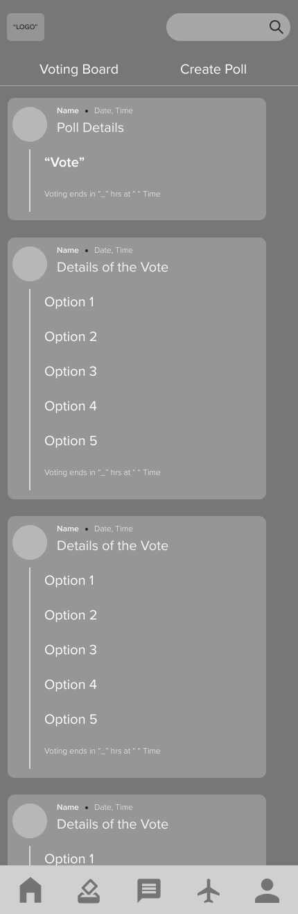
Utilize List View in the Voting Poll
- Allows flexibility in voting poll creation to meet user needs
- The option gives users the ability to make and vote quickly
Upload Messages, Reminders, or Photos
- Makes sure everyone is on the same page via reminders or announcements
- Important information can be fixed on the Landing Page
- Multimedia and messaging inclusion increases the sense of entertainment and engagement
View Final Prototype
Research Phase
What steps did I take to arrive at this solution?
Competitive Analysis
Existing mobile products predominantly emphasize features facilitating trip planning rather than addressing communication regarding issues that may arise during the journey.
I performed a competitive analysis to explore how mobile applications assist users in managing group disagreements while traveling. Reviews frequently highlighted the effectiveness or shortcomings of the planning functionalities within these apps, rather than focusing on communication aspects.
Wanderlog
Most collaborative
Many features, but has a steep learning curve
Positive reviews often mention clarity via collaboration
Simple to use interface
No collaborative features
TripIt

Collaborative
Lack of features
Pebblar
Brand loyalty
Variety of features
Often used in conjunction with iMessage and texting
Google Products
User Interviews & Insights
Coming away from the six user interviews I conducted, I complied the gathered data into two major themes: Communication & Enjoyment.
The First Theme: Communication
Users often foresee group misunderstandings or disagreements occurring during a trip, and preemptively prepare themselves for it.
”Group trips can be stressful. Trying to satisfy everyone is complex, and I mean, really satisfy everyone... so that people don’t later on resent the trip because they didn’t feel comfortable sharing their wants or ideas.”

Registered Nurse
Reaching a group consensus is challenging and adds to trip stressors.
Users stress about various details of the trip (Lodging, Budgeting, Transportation), and stress about the inability of other group members inability to commit to plans, or communicate their opinions.
“People take too long to reply in the group chat; There were talks about things being too expensive, some people had things that were nonnegotiable. People would just stop replying.”
Software Engineer
“I think people often say yes {to a trip} without fully committing or thinking about it. Sometimes, everyone waits for another person to book a ticket before doing so. This makes it difficult to gauge who is actually going and how many people to book an Airbnb for.”
Professional Bodybuilder
Most users, especially users who have experience going on group trips, are already acutely aware of the upcoming stress during the excursion’s planning stages. There are instances in which this stress can halt the trip altogether.
The Second Theme: Enjoyment
Group trips aim to create enjoyment and memories; Users still voluntarily participate in them, regardless of possible complications and stressors.
Although users are privy to experiencing stress, they often remain hopeful that it won’t completely impede their promise of fun.
“I think with such a big group it definitely requires more planning and sometimes compromises, but at the same time, it was super fun having a big group for dinner and partying.”
Pharmacist
Group Trips have the potential to sit on extremes when it comes to enjoyment. Conflict sours it, but sharing positive memories elevates it.
Users view solo trips as introspective, calm, and stress-free, but often remarked on a favorable group trip being their “favorite memory.”
“It was memorable because several families from my wife’s side were also present. Having them present left a stronger impression on events.”
Finance Analyst
“Our whole family went to Italy! It was a great way to reconnect with other family members. It was fun and memorable.”
School Teacher
From User Input -> Empathic, Empirical Data
Personas
Synthesizing the interview data, I created two personas that would use my intended mobile product. These two personas represent diametric opposites of people on group trips: someone who is concise, itinerary oriented, and organized, and another who is free spirited, adaptable, and prefers an open schedule. Creating an application with these personalities in mind should serve a larger population.
Consider the persona scenario below:
Erin

She has upcoming time off and is currently brainstorming taking either a group or solo trip.
Will Erin Have Fun?
%
of
Fun


# of Trip Stressors


Group Trip w/ Minimal Stressors
Group Trip w/ Max Stressors
Solo Trip
A product that generates more persona experiences similar to the green dot, which helps minimize trip stressors and allows users to focus on collective memory creation, would create satisfaction and return users.
The question at hand...
How might we create features that have simple and clear task flows that allow for users to reach agreements easily?
Ideation Phase
How did I turn this data into serviceable actions?
Prioritization
Although planning and communication are often parts of features that coincide with digital travel products, I decided to switch the main focus from the itinerary planning-based applications, and go all in on features that could solve communication issues. To this end, I thought up of several ‘must-have’’ features that could do just that.
Must Have
Must Have
- Voting Page
- Polling Results
- Message Board
- Trip Logistics
Nice to Have
- ‘Game-ifying UI’
- User Profiles
Surprising
- Photo Comments
- Video Calls
Comes Later
- Itinerary Sync’ing
- App Intergration
w/ Maps & Airlines
Task Flows
With the features decided, I wanted to center the main task flows around the voting feature that could help alleviate any conflict scenarios.
With the user in mind, I focused on devising simple task flows that would only take manageable cognitive loads. If they’re on a trip, it’s important that it feel less like work or a chore, and instead, more like a simple activity.
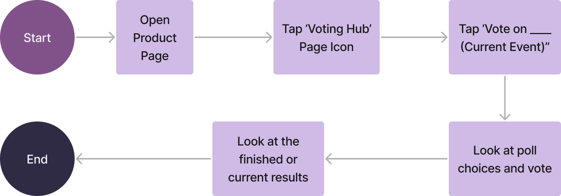
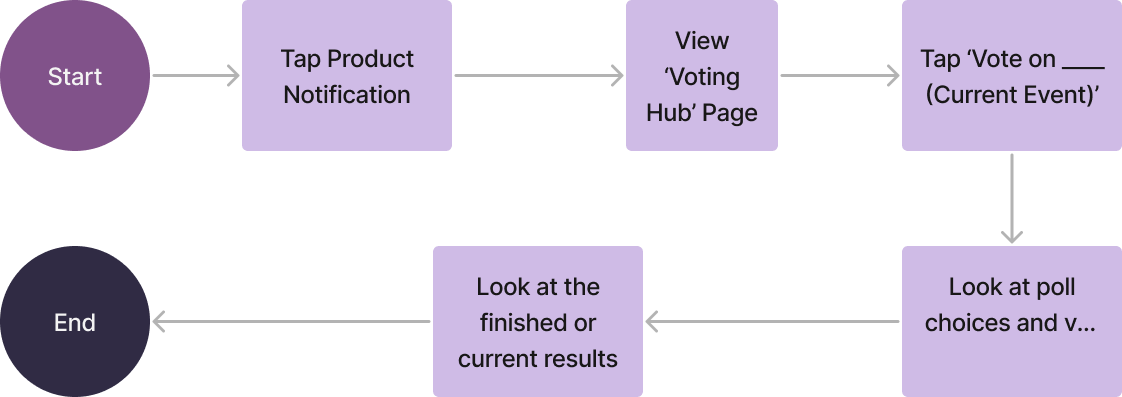
The voting should feel simple.
Voting from App - No Pinged Notification
Voting from App - No Pinged Notification
Design Phase
How did I organize the structure and create the features?
Low to Mid Fidelity Wireframes
I considered several criteria when working through low and mid fidelity; Below are the needs I addressed when consolidating all the collected information into physical designs.
The Central Feature: The Voting Flow
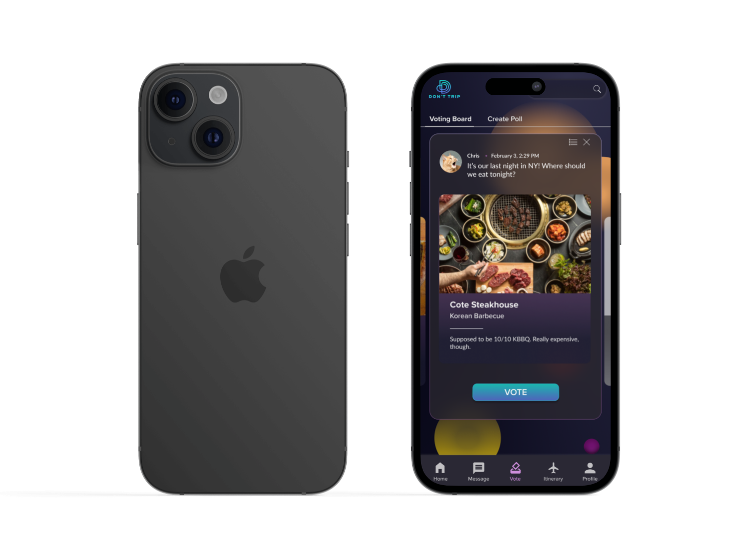
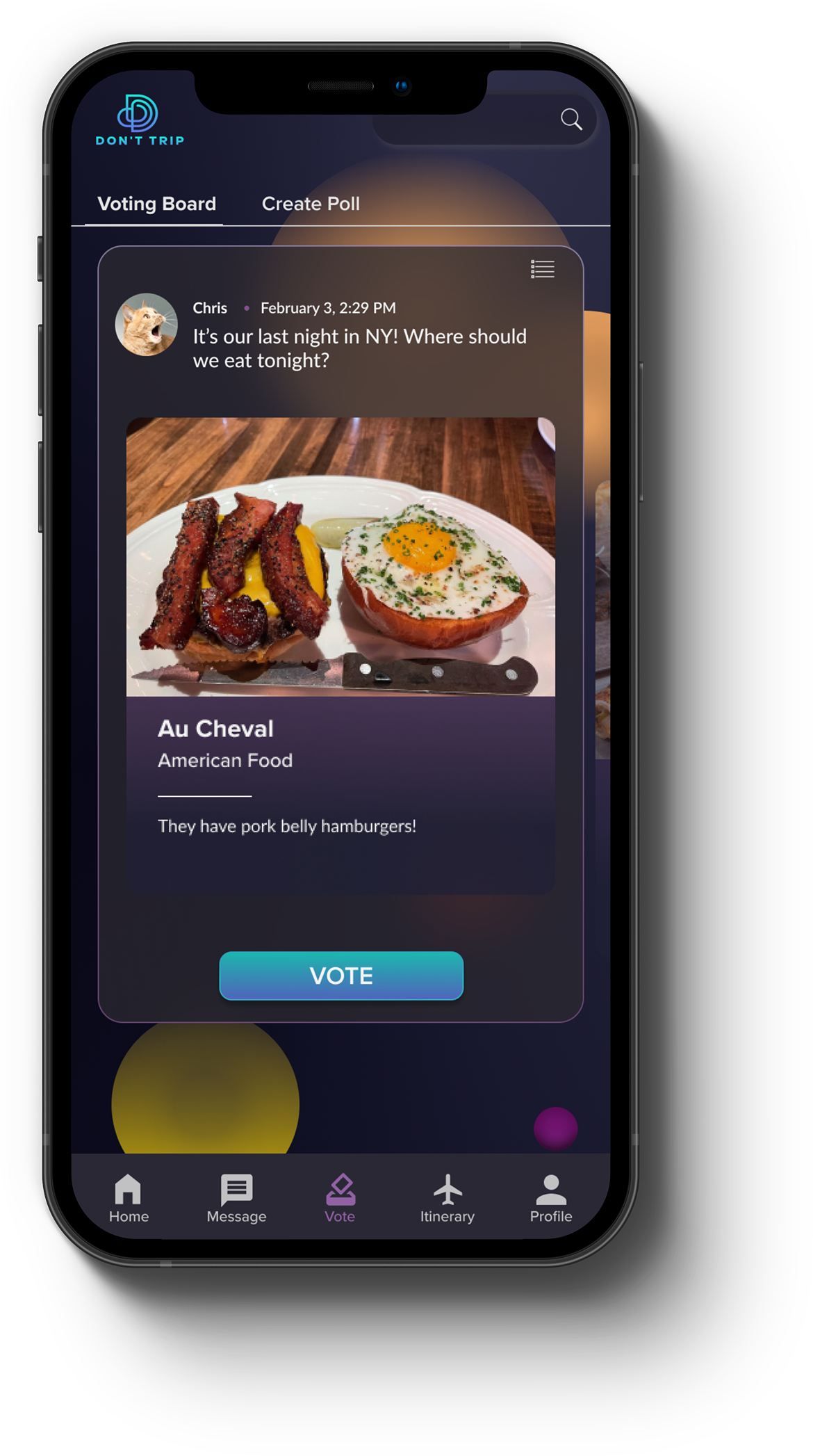
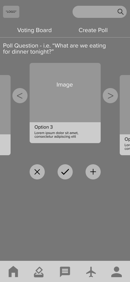
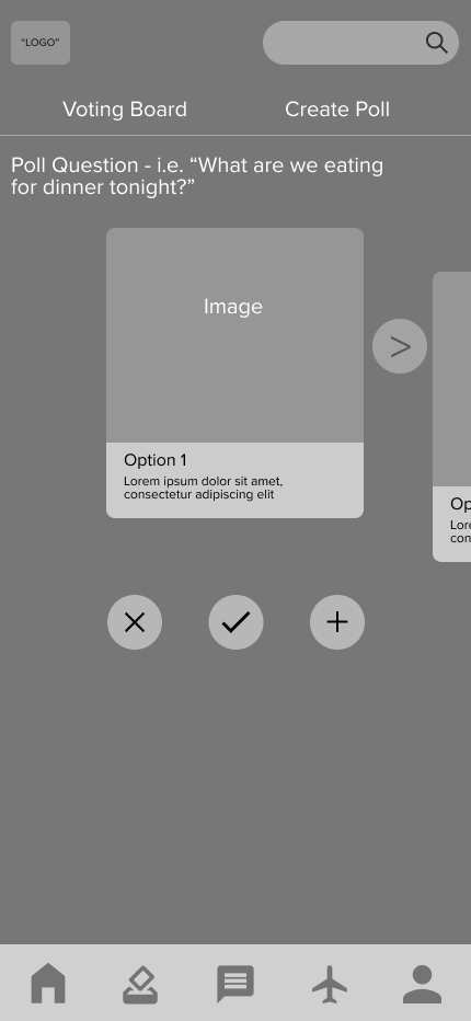
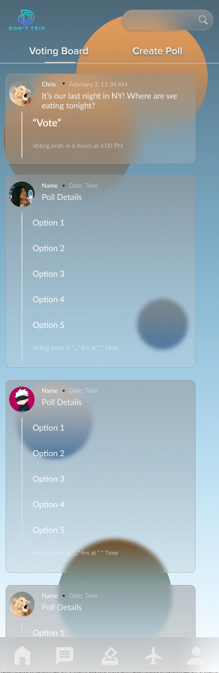
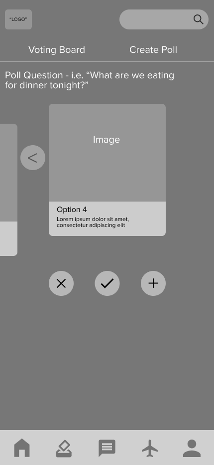
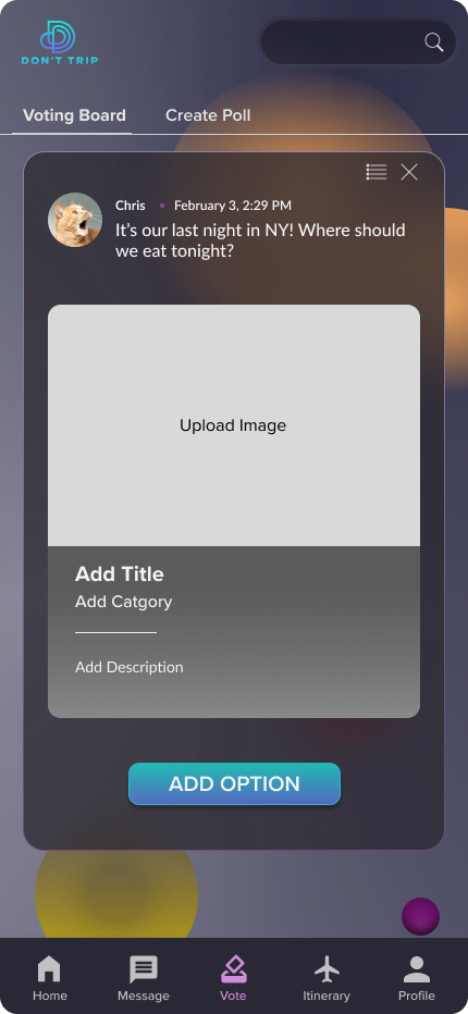
The initial concept of the ‘Voting User Flow’ revolved around integrating a visually engaging "carousel" feature with images, aimed at captivating users while facilitating group communication and fostering consensus.
Positive engagement holds the potential to cultivate enjoyment, an essential sentiment that users should experience throughout their journey.
Including images also allows users to input better information gathering to allow others to make more informed decisions.
- Utilize similar UI present on popular social media
There needs to be a fast learning curve, so the application is quickly understood and utilized
- Designated section on the landing page for crucial information and trip reminders
- Message and photo features
Ability to track miscellaneous forms of data needed for the trip
- A flow that allows visible, equal voting by all members
- Poll page to view past results as well as verify voters
A quick, visible, and fair method that allows for users to reach agreements
User Need
Applied Design
User Need
User Need
Applied Design
Applied Design

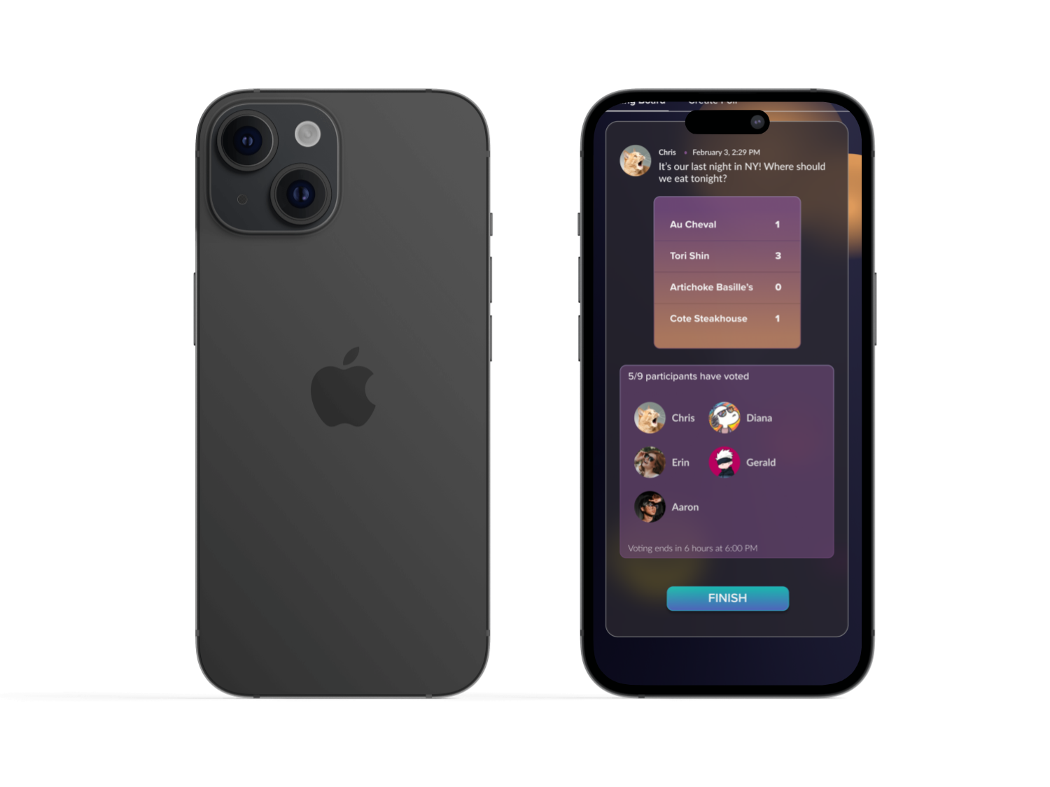
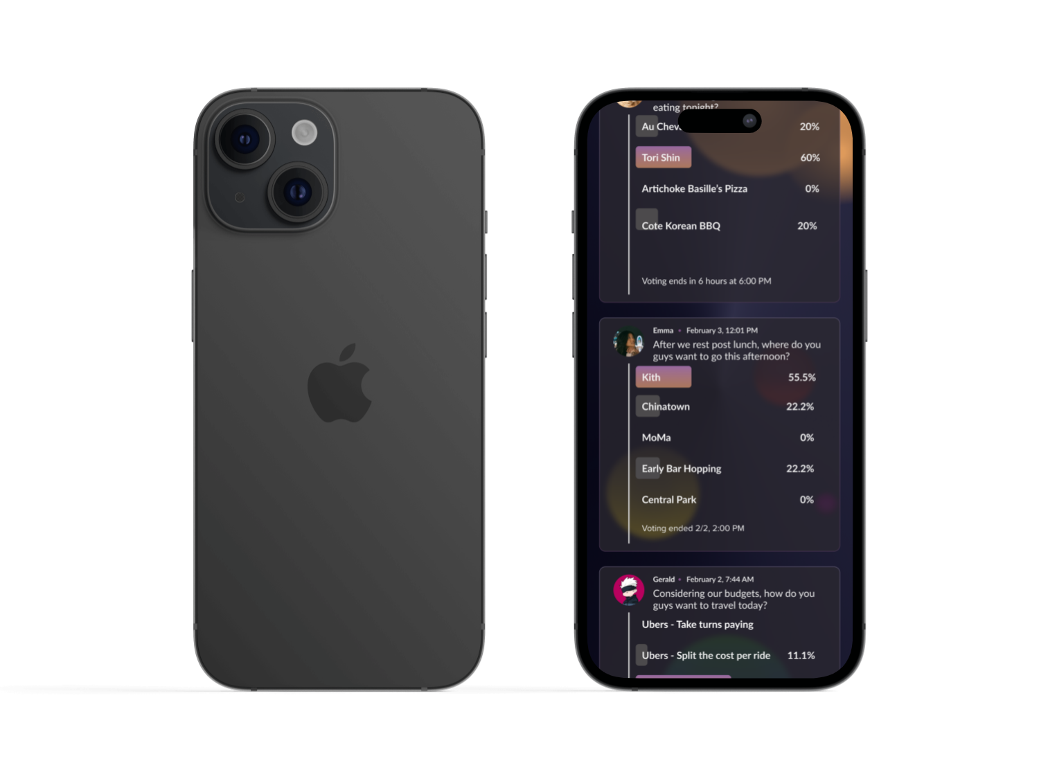
Additional Features: The Polling Page & Message Board
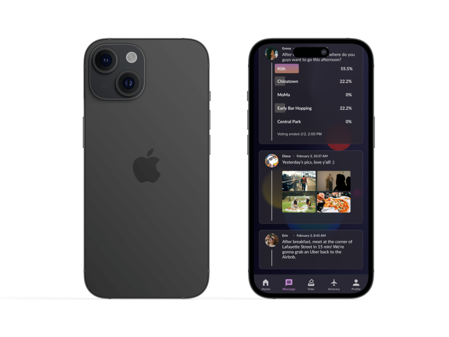
The overall UI structure allows for the most recent polls, messages, and images to appear first, a feature similar to current social media trends. A section on the landing page is meant to stay permanent, and is set there as a hub for users to edit real-time reminders to themselves and other party members.
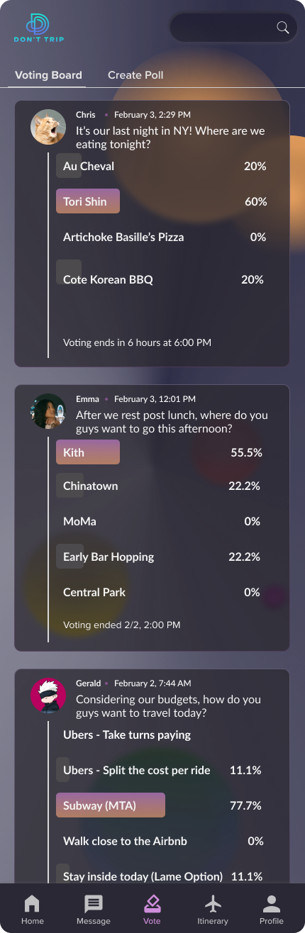
The polling page has receipts of previous polls available, and the percentages allotted to each option.
High Fidelity Wireframes
Testing after the mid-fidelity wireframes prompted several changes when drafting the hi-fi frames.
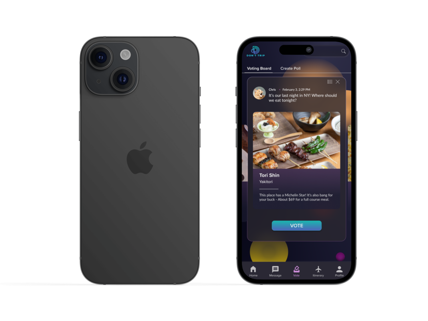
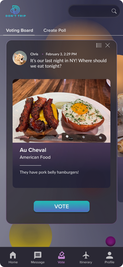
- The circular “CTA” buttons of voting were replaced with a singular, significant “VOTE” Button.
The original design had buttons beside one another to convey convenience via proximity, but grouping them together caused initial confusion during user testing.
User testing also showed that the amount of elements in the card and foreground caused user performance to slow down during the initial testing.
This may have been caused by the grayscale of the mid-fidelity designs; Moving forward into the high-fidelity designs, I focused on making information appear distinct by text size and characteristics (boldness), as well as color and positioning.
The card color is similar to the background color to allow the text to pop, and the “CTA” button is the same vibrant blue hue as the logo, allowing it to shine on screen while maintaining a sense of visual harmony.
- User icon and accompanying text is in the same format as the message board and polling page to promote congruence.
- Different text weights define text classification and importance.
- Singular, CTA button colored with the secondary palette. Text is in all caps.
- Image in card takes up more real estate than the description portion, allowing for visual focus.
- Card color similar to foreground color, but distinct enough to maintain own form.
Glassmorphism Troubleshooting
Glassmorphism is the intended style approach for this product. It’s modern and trendy to target a young adult demographic, and the look easily lends itself to messages and voting that can be formatted and organized via cards.
However, as a designer with limited exposure, I needed help with setting up this visual style.
During hi-fi frame ideation:
- The color scheme was overhauled & additional colors were inserted for dimension.
- The original light color scheme was noted to hinder accessibility.
- The Glassmorphism UI and overall card structure remain.

Branding
Testing &
Iterations
How did Usability Testing go?
I conducted user testing with 10 participants, both in person and via Facetime video calls.
Usability Task:
- Open the application after receiving a notification. Navigate to the landing page, and then to the voting hub.
- After reading the prompt, open the “Current Voting Poll” and vote for the second restaurant option.
Results and Findings:
The testing concluded with a 100% completion rate.
However, 3/10 participants had never seen a carousel format within a digital application before. It took them about two to three minutes to navigate the carousel, which is approximately double the time it took the other seven users to understand the flow intuitively. Still, the three users presented visible delight and satisfaction upon initiating a successful interaction.
Overall, the voting feature was intuitive, user friendly, and enjoyable.
“I didn’t understand the scrolling option before. I wish it were easier to see the image off to the side, so I knew there were more options. Still, it’s cool, and I was impressed once I figured out to swipe to the right {to see other options}.”
Physical Therapist
Iteration Focus & Possible Additions:
These problem areas needed to be worked on directly related to user control and freedom.
- Per the user testing, the inability to immediately recognize carousel interactions.
- The ability to abstain from voting altogether.
Key Improvements
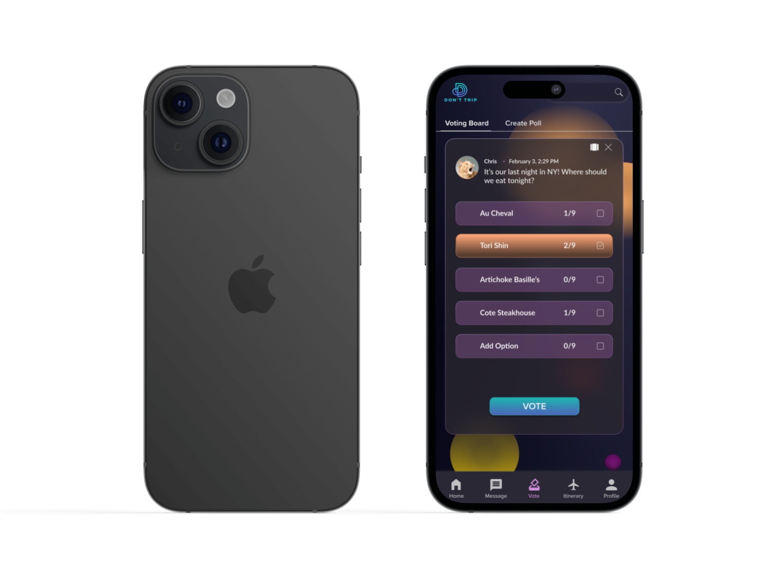
Addition of List Option and Exit Button
- Based on user testing, a simple voting format was added to the engaging carousel, so the product could suit the user’s immediate needs.
- An exit button was added to abstain or decide later, so users don’t feel trapped in decision-making.
- These edits should help add user freedom and flexibility to the voting flow.
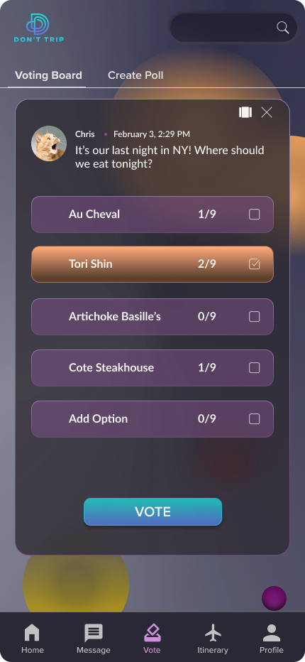
“Add an Option” card is inserted into the carousel and lists options
- Based on mentor feedback, placing the option button as an additional card made the UI sleeker and the overall process more intuitive for the user.
- This option was originally placed by the Voting CTA button, which could incite user confusion.
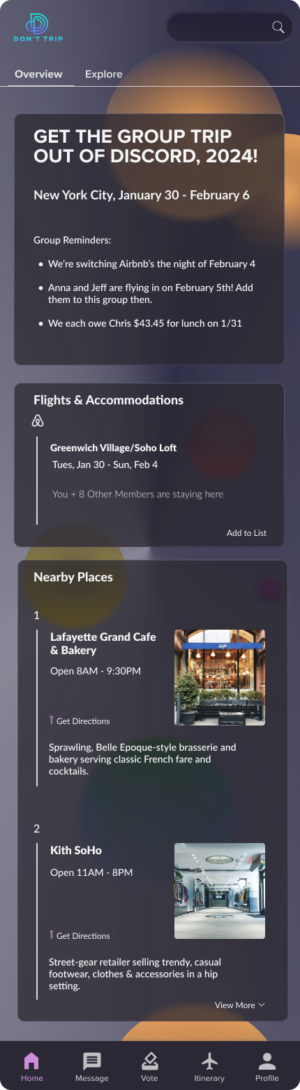
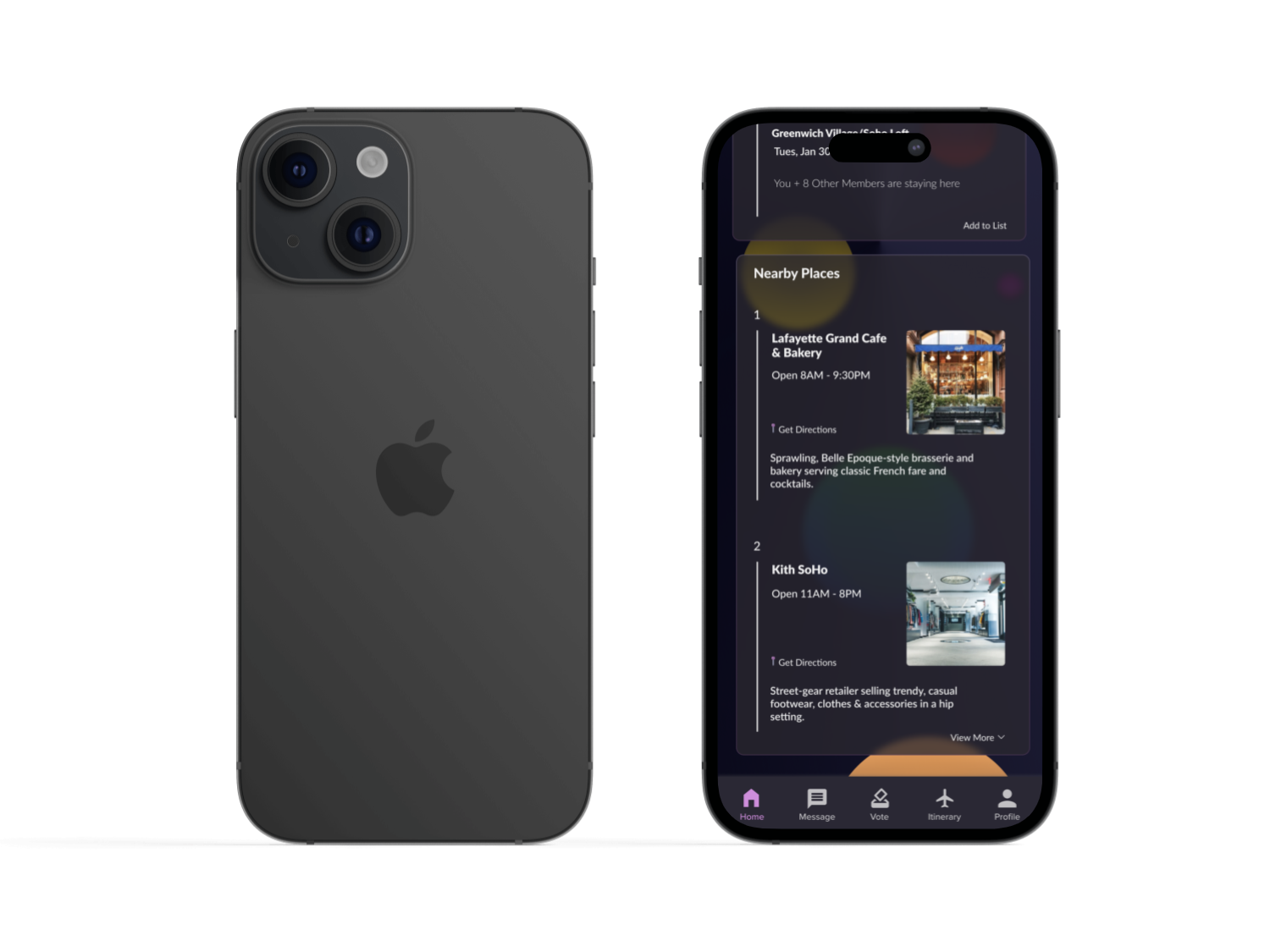
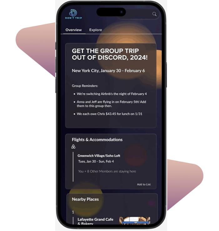
Landing page to include flights & accommodations, nearby resources
- Originally, this page was meant to act as a compilation of the most recent user activity.
- Including essential details on the landing page gives users easy access.
- The inclusion of resources list gives users last-minute ideas for their trip and voting polls.
Results & Looking Forward
What’s next for Don’t Trip?
Miscommunication and disagreements during extensive group trips lead to lower enjoyment and satisfaction levels.
The Problem
The Solution
Create a feature that allows users to concretely dissolve group discord, so they can focus on making the most of their collective trip.
Interactive Voting Options via Carousel
- Scrolling action creates a sense of interaction that “gamifies”
- The ability to customize images and descriptions gives users creative freedom
- Engagement of feature encourages repeated use
Utilize List View in the Voting Poll
- Allows flexibility in voting poll creation to meet user needs
- The option gives users the ability to make and vote quickly

Upload Messages, Reminders, or Photos
- Makes sure everyone is on the same page via reminders or announcements
- Important information can be fixed on the Landing Page
- Multimedia and messaging inclusion increases the sense of entertainment and engagement
View Final Prototype
Key Takeaways and Future Iterations
Given more time, I would...
- Add a calendar UI with a synchronization feature
- Create the “Add Option” flow and put it through user testing
- Explore more methods to increase the entertainment value and further “gamify” the product
- Further test the current “Glassmorphism” accessibility and test out a “light mode” or flat UI
Role
Timeline
Tools
Responsibilities
UI/UX Designer
January 2024 - February 2024 (4 Weeks)
ChatGPT, Figma, Giphy, Google Workspace
User Research & Testing, Data Analysis, Information Architecture, Wireframing, Visual Design, Prototyping
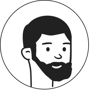
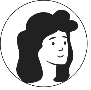
Female, 25
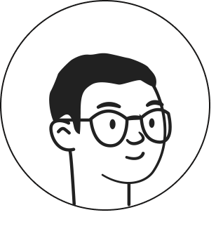
Male, 28
Male, 30
Male, 29
Male, 29
Male, 56
Female, 41

Male, 34
Angelo Arambulo ⏤ 2025
Don’t Trip
A mobile app facilitating group consensus and connectivity for enhanced enjoyment and coordination during group trips.
Role
UI/UX Designer
Timeline
January 2024 - February 2024 (4 Weeks)
Tools
ChatGPT, Figma, Giphy, Google Workspace
Responsibilities
User Research & Testing, Data Analysis, Information Architecture, Wireframing, Visual Design, Prototyping
What is the product?
Group Communication on trips often looks like this....
A
B
?
A
B
?
... when it should look like this.
Miscommunication and disagreements during extensive group trips lead to lower enjoyment and satisfaction levels.
The Problem
The Solution
Create a feature that allows users to concretely dissolve group discord, so they can focus on making the most of their collective trip.

Interactive Voting Options via Carousel
- Scrolling action creates a sense of interaction that “gamifies”
- The ability to customize images and descriptions gives users creative freedom
- Engagement of feature encourages repeated use

Utilize List View in the Voting Poll
- Allows flexibility in voting poll creation to meet user needs
- The option gives users the ability to make and vote quickly


Upload Messages, Reminders, or Photos
- Makes sure everyone is on the same page via reminders or announcements
- Important information can be fixed on the Landing Page
- Multimedia and messaging inclusion increases the sense of entertainment and engagement
View Final Prototype
Research Phase
What steps did I take to arrive at this solution?
I performed a competitive analysis to explore how mobile applications assist users in managing group disagreements while traveling. Reviews frequently highlighted the effectiveness or shortcomings of the planning functionalities within these apps, rather than focusing on communication aspects.
Wanderlog
Most collaborative
Many features, but has a steep learning curve
Positive reviews often mention clarity via collaboration
Simple to use interface
No collaborative features
Collaborative
Lack of features
Brand loyalty
Variety of features
Often used in conjunction with iMessage and texting
TripIt
Pebblar
Google Products
Coming away from the six user interviews I conducted, I complied the gathered data into two major themes: Communication & Enjoyment.
The First Theme: Communication
Users often foresee group misunderstandings or disagreements occurring during a trip, and preemptively prepare themselves for it.
”Group trips can be stressful. Trying to satisfy everyone is complex, and I mean, really satisfy everyone... so that people don’t later on resent the trip because they didn’t feel comfortable sharing their wants or ideas.”


Registered Nurse
Reaching a group consensus is challenging and adds to trip stressors.
Users stress about various details of the trip (Lodging, Budgeting, Transportation), and stress about the inability of other group members inability to commit to plans, or communicate their opinions.
Software Engineer
“I think people often say yes {to a trip} without fully committing or thinking about it. Sometimes, everyone waits for another person to book a ticket before doing so. This makes it difficult to gauge who is actually going and how many people to book an Airbnb for.”

Professional Bodybuilder
Most users, especially users who have experience going on group trips, are already acutely aware of the upcoming stress during the excursion’s planning stages. There are instances in which this stress can halt the trip altogether.
The Second Theme: Enjoyment
Group trips aim to create enjoyment and memories; Users still voluntarily participate in them, regardless of possible complications and stressors.
Although users are privy to experiencing stress, they often remain hopeful that it won’t completely impede their promise of fun.
“I think with such a big group it definitely requires more planning and sometimes compromises, but at the same time, it was super fun having a big group for dinner and partying.”
Pharmacist
Group trips have the potential to sit on extremes when it comes to enjoyment. Conflict sours it, but sharing positive memories elevates it.
Users view solo trips as introspective, calm, and stress-free, but often remarked on a favorable group trip being their “favorite memory.”
“It was memorable because several families from my wife’s side were also present. Having them present left a stronger impression on events.”

Finance Analyst
“Our whole family went to Italy! It was a great way to reconnect with other family members. It was fun and memorable.”
School Teacher
Synthesizing the interview data, I created two personas that would use my intended mobile product. These two personas represent diametric opposites of people on group trips: someone who is concise, itinerary oriented, and organized, and another who is free spirited, adaptable, and prefers an open schedule. Creating an application with these personalities in mind should serve a larger population.
Consider the persona scenario below:
Erin

She has upcoming time off and is currently brainstorming taking either a group or solo trip.


# of Trip Stressors
% of Fun
Will Erin Have Fun?


Group Trip w/ Minimal Stressors
Group Trip w/ Max Stressors
Solo Trip
A product that generates more persona experiences similar to the green dot, which helps minimize trip stressors and allows users to focus on collective memory creation, would create satisfaction and return users.
The question at hand...
How might we create features that have simple and clear task flows that allow for users to reach agreements easily?
Ideation Phase
How did I turn this data into serviceable actions?
Although planning and communication are often parts of features that coincide with digital travel products, I decided to switch the main focus from the itinerary planning-based applications, and go all in on features that could solve communication issues. To this end, I thought up of several ‘must-have’’ features that could do just that.
Must Have
Must Have
- Voting Page
- Polling Results
- Message Board
- Trip Logistics
Nice to Have
- ‘Game-ifying UI’
- User Profiles
Surprising
- Photo Comments
- Video Calls
Comes Later
- Itinerary Sync’ing
- App Intergration
w/ Maps & Airlines
With the user in mind, I focused on devising simple task flows that would only take manageable cognitive loads. If they’re on a trip, it’s important that it feel less like work or a chore, and instead, more like a simple activity.
The voting should feel simple.
Voting from App - No Pinged Notification
Voting from App - Pinged Notification
Design Phase
How did I organize the structure and create the features?
I considered several criteria when working through low and mid fidelity; Below are the needs I addressed when consolidating all the collected information into physical designs.
User Needs
Applied Design
A quick, visible, and fair method that allows for users to reach agreements
- A flow that allows visible, equal voting by all members
- Poll page to view past results as well as verify voters
- Designated section on the landing page for crucial information and trip reminders
- Message and photo features
- Utilize similar UI present on popular social media
Ability to track miscellaneous forms of data needed for the trip
There needs to be a fast learning curve, so the application is quickly understood and utilized
The initial concept of the ‘Voting User Flow’ revolved around integrating a visually engaging "carousel" feature with images, aimed at captivating users while facilitating group communication and fostering consensus.
Positive engagement holds the potential to cultivate enjoyment, an essential sentiment that users should experience throughout their journey.
Including images also allows users to input better information gathering to allow others to make more informed decisions.
The overall UI structure allows for the most recent polls, messages, and images to appear first, a feature similar to current social media trends. A section on the landing page is meant to stay permanent, and is set there as a hub for users to edit real-time reminders to themselves and other party members.
The polling page has receipts of previous polls available, and the percentages allotted to each option.
Testing after the mid-fidelity wireframes prompted several changes when drafting the hi-fi frames.
- The circular “CTA” buttons of voting were replaced with a singular, significant “VOTE” Button.
The original design had buttons beside one another to convey convenience via proximity, but grouping them together caused initial confusion during user testing.
User testing also showed that the amount of elements in the card and foreground caused user performance to slow down during the initial testing.
This may have been caused by the grayscale of the mid-fidelity designs; Moving forward into the high-fidelity designs, I focused on making information appear distinct by text size and characteristics (boldness), as well as color and positioning.
The card color is similar to the background color to allow the text to pop, and the “CTA” button is the same vibrant blue hue as the logo, allowing it to shine on screen while maintaining a sense of visual harmony.


User icon and accompanying text is in the same format as the message board and polling page to promote congruence.

Different text weights define text classification and importance.

Singular, CTA button colored with the secondary palette.
Text is in all caps.
Image in card takes up more real estate than the description portion, allowing for visual focus.
Card color similar to foreground color, but distinct enough to maintain own form.
Glassmorphism is the intended style approach for this product. It’s modern and trendy to target a young adult demographic, and the look easily lends itself to messages and voting that can be formatted and organized via cards.
However, as a designer with limited exposure, I needed help with setting up this visual style.
During hi-fi frame ideation:
- The color scheme was overhauled & additional colors were inserted for dimension.
- The original light color scheme was noted to hinder accessibility.
- The Glassmorphism UI and overall card structure remain.

Testing & Iterations
How did usability testing go?
I conducted user testing with 10 participants, both in person and via Facetime video calls.
Usability Task:
The testing concluded with a 100% completion rate.
However, 3/10 participants had never seen a carousel format within a digital application before. It took them about two to three minutes to navigate the carousel, which is approximately double the time it took the other seven users to understand the flow intuitively. Still, the three users presented visible delight and satisfaction upon initiating a successful interaction.
Overall, the voting feature was intuitive, user friendly, and enjoyable.
“I didn’t understand the scrolling option before. I wish it were easier to see the image off to the side, so I knew there were more options. Still, it’s cool, and I was impressed once I figured out to swipe to the right {to see other options}.”
Physical Therapist
Iteration Focus & Possible Additions:
Key Improvements
Addition of List Option and Exit Button
- Based on user testing, a simple voting format was added to the engaging carousel, so the product could suit the user’s immediate needs.
- An exit button was added to abstain or decide later, so users don’t feel trapped in decision-making.
- These edits should help add user freedom and flexibility to the voting flow.
&

Icon to switch back and forth between ‘carousel’ and ‘list’ view.
“Add an Option” card is inserted into the carousel and lists options
- Based on mentor feedback, placing the option button as an additional card made the UI sleeker and the overall process more intuitive for the user.
- This option was originally placed by the Voting CTA button, which could incite user confusion.
Landing page to include flights & accommodations, nearby resources
- Originally, this page was meant to act as a compilation of the most recent user activity.
- Including essential details on the landing page gives users easy access.
- The inclusion of resources list gives users last-minute ideas for their trip and voting polls.
Results & Looking Forward
What’s next for Don’t Trip?
Miscommunication and disagreements during extensive group trips lead to lower enjoyment and satisfaction levels.
The Problem
The Solution
Create a feature that allows users to concretely dissolve group discord, so they can focus on making the most of their collective trip.
Interactive Voting Options via Carousel
- Scrolling action creates a sense of interaction that “gamifies”
- The ability to customize images and descriptions gives users creative freedom
- Engagement of feature encourages repeated use
Utilize List View in the Voting Poll
- Allows flexibility in voting poll creation to meet user needs
- The option gives users the ability to make and vote quickly
Upload Messages, Reminders, or Photos
- Makes sure everyone is on the same page via reminders or announcements
- Important information can be fixed on the Landing Page
- Multimedia and messaging inclusion increases the sense of entertainment and engagement
View Final Prototype
Key Takeaways and Future Iterations
Given more time, I would...
- Add a calendar UI with a synchronization feature
- Create the “Add Option” flow and put it through user testing
- Explore more methods to increase the entertainment value and further “gamify” the product
- Further test the current “Glassmorphism” accessibility and test out a “light mode” or flat UI
“People take too long to reply in the group chat; There were talks about things being too expensive, some people had things that were nonnegotiable. People would just stop replying.”
During a group trip, a mutual friend and I discovered that substantial information about plans and events often gets lost in translation.
This product diffuses arguments that can lead to trip hostility, and focuses on how differing opinions can be turned into mutual clarity.
Competitive Analysis
User Interviews & Insights
Female, 25
Male, 28
Male, 30
Male, 29
Male, 56
Female, 41
From User Input -> Empathic, Empirical Data
Personas
The question at hand...
Existing mobile products predominantly emphasize features facilitating trip planning rather than addressing communication regarding issues that may arise during the journey.
Prioritization
Task Flows
With the features decided, I wanted to center the main task flows around the voting feature that could help alleviate any conflict scenarios.
Low to Mid Fidelity Wireframes
The Central Feature: The Voting Flow
Additional Features: The Polling Page & Message Board
High Fidelity Wireframes
Glassmorphism Troubleshooting
- Open the application after receiving a notification. Navigate to the landing page, and then to the voting hub.
- After reading the prompt, open the “Current Voting Poll” and vote for the second restaurant option.
Male, 34
These problem areas needed to be worked on directly related to user control and freedom.
- Per the user testing, the inability to immediately recognize carousel interactions.
- The ability to abstain from voting altogether.
Results and Findings: